

Brand identity redesign for Taiwanese eyewear brand KlassiC.
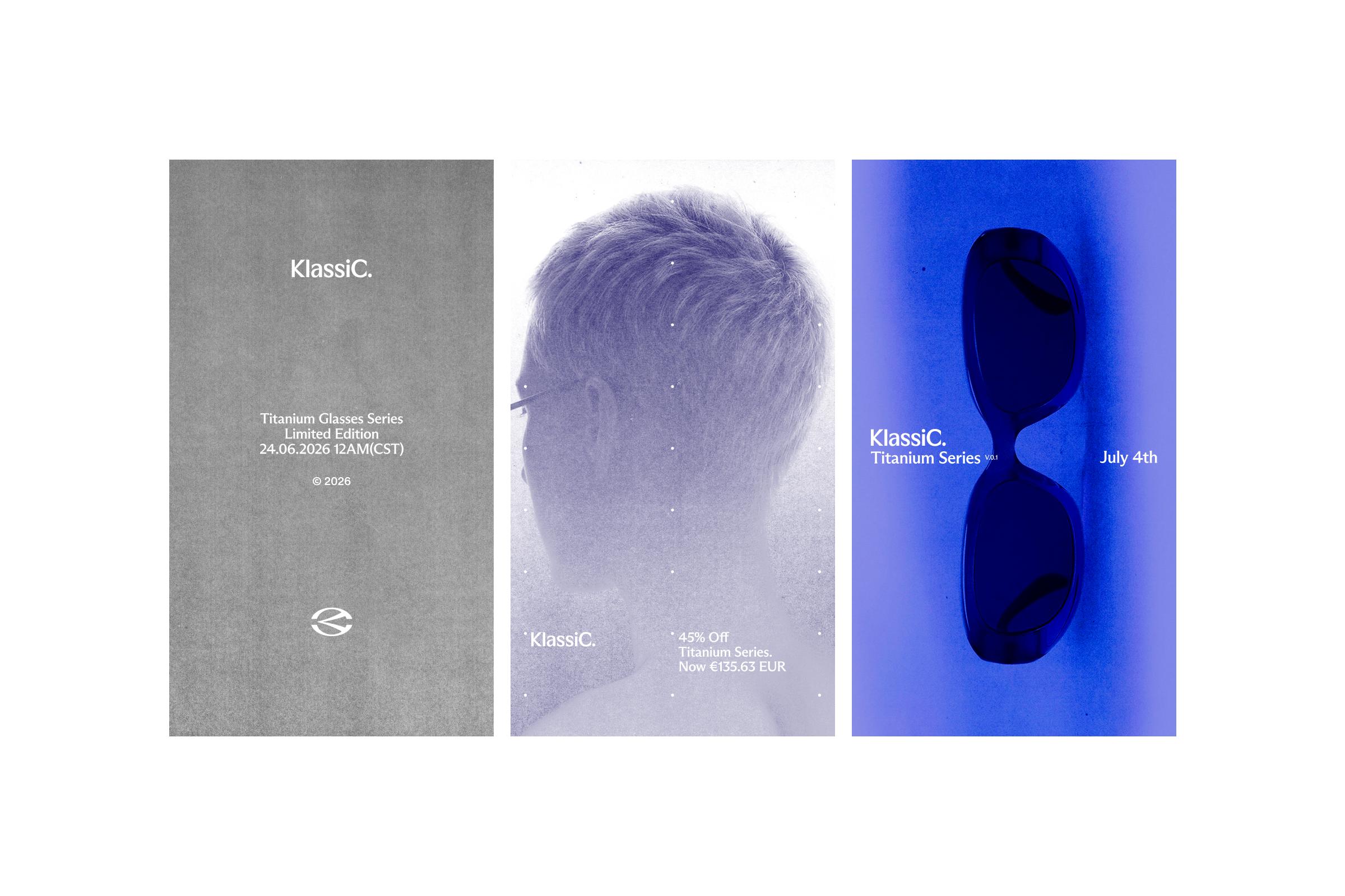
KlassiC is a Taiwan-based eyewear brand that has built its identity through playful communication, lifestyle-driven visuals, and strong recognition centered around its signature blue color and distinctive forms.
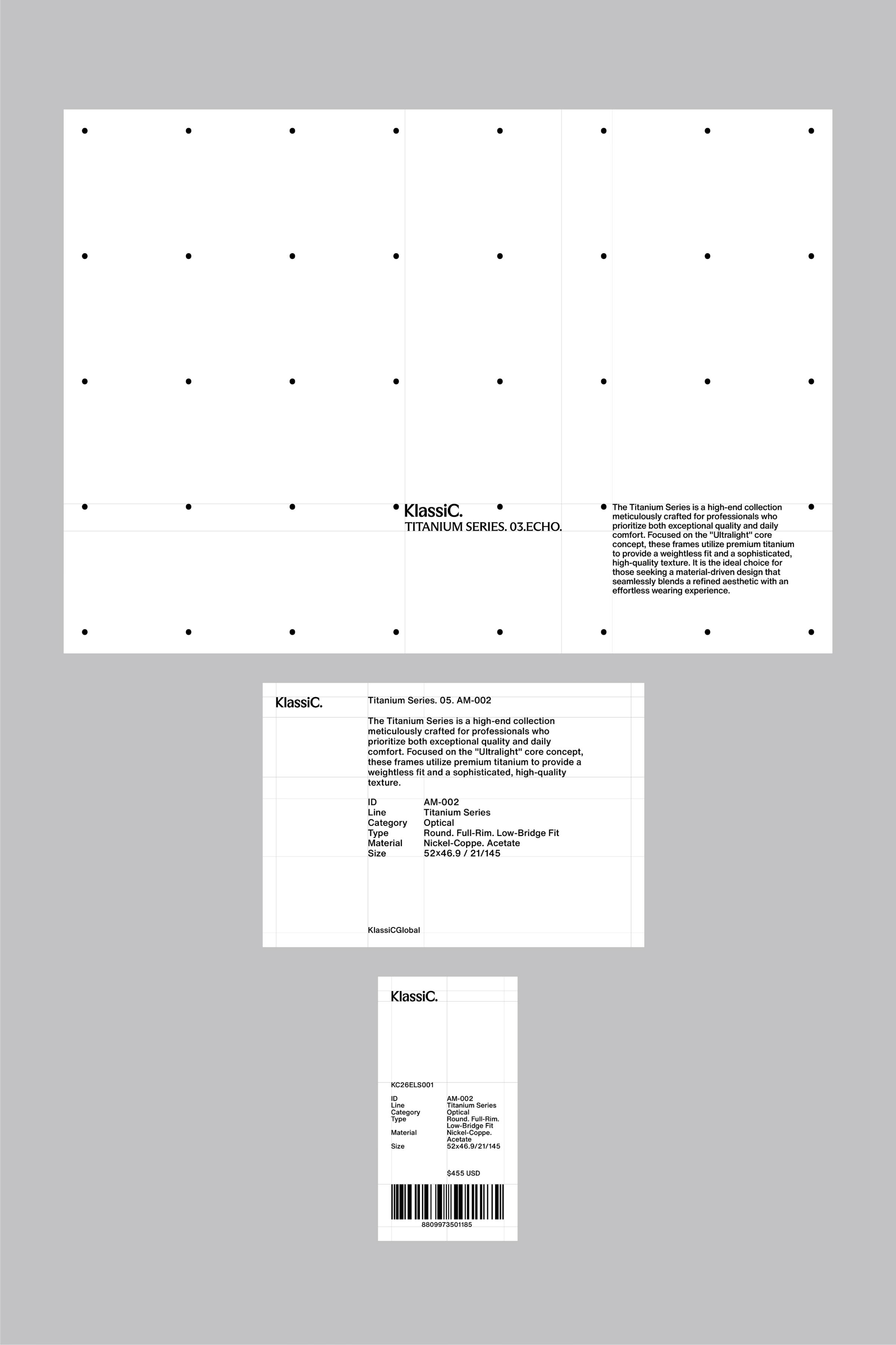
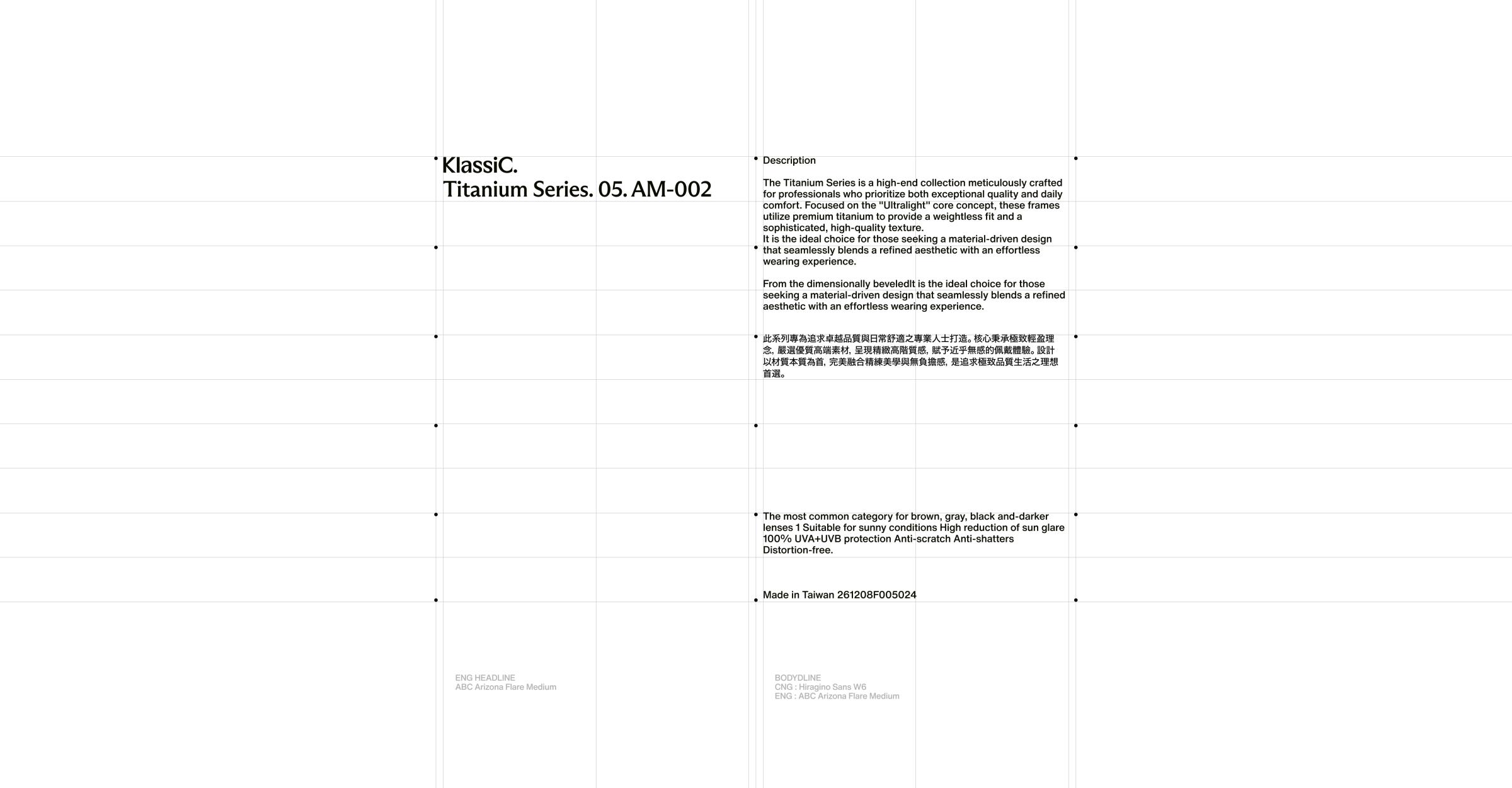
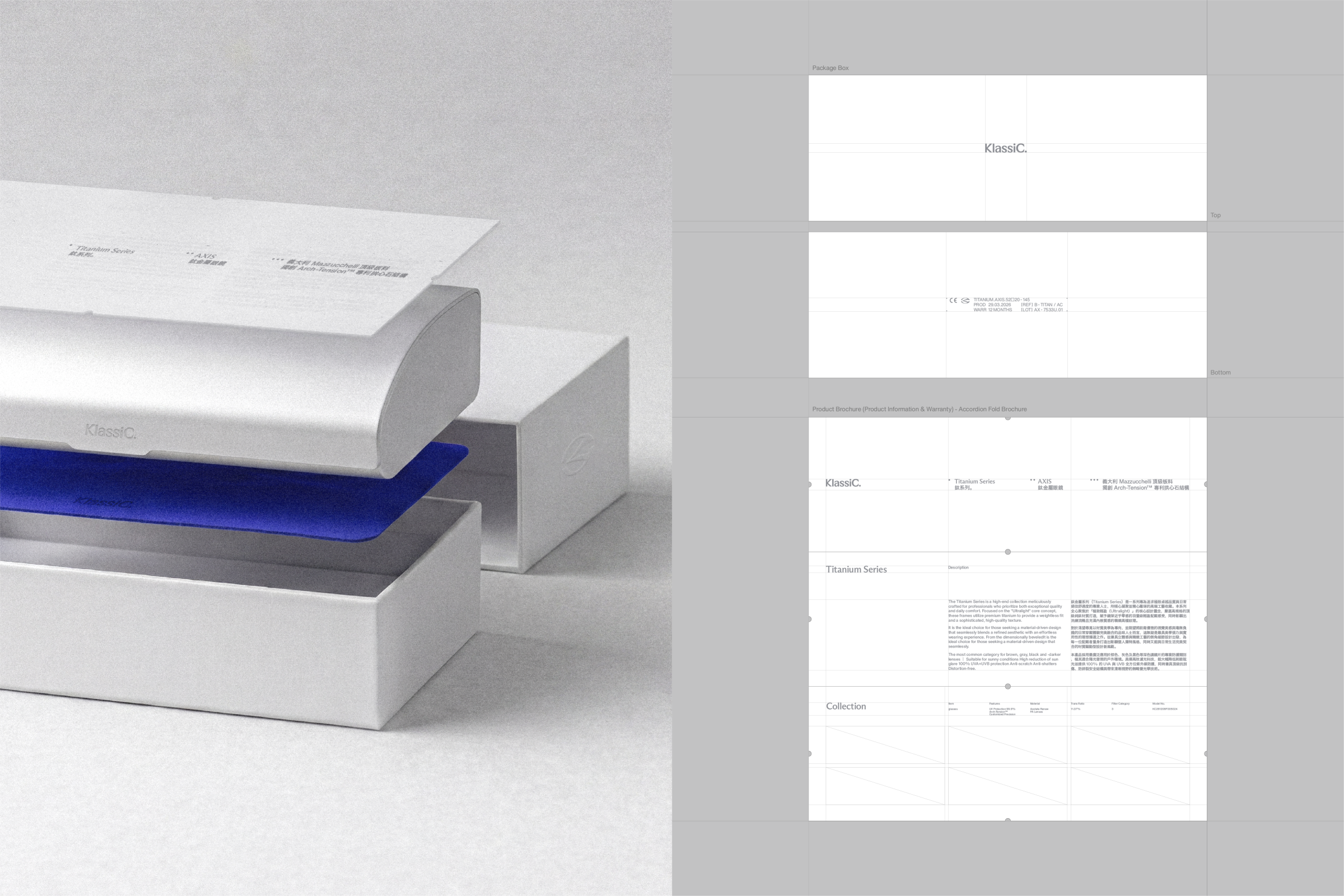
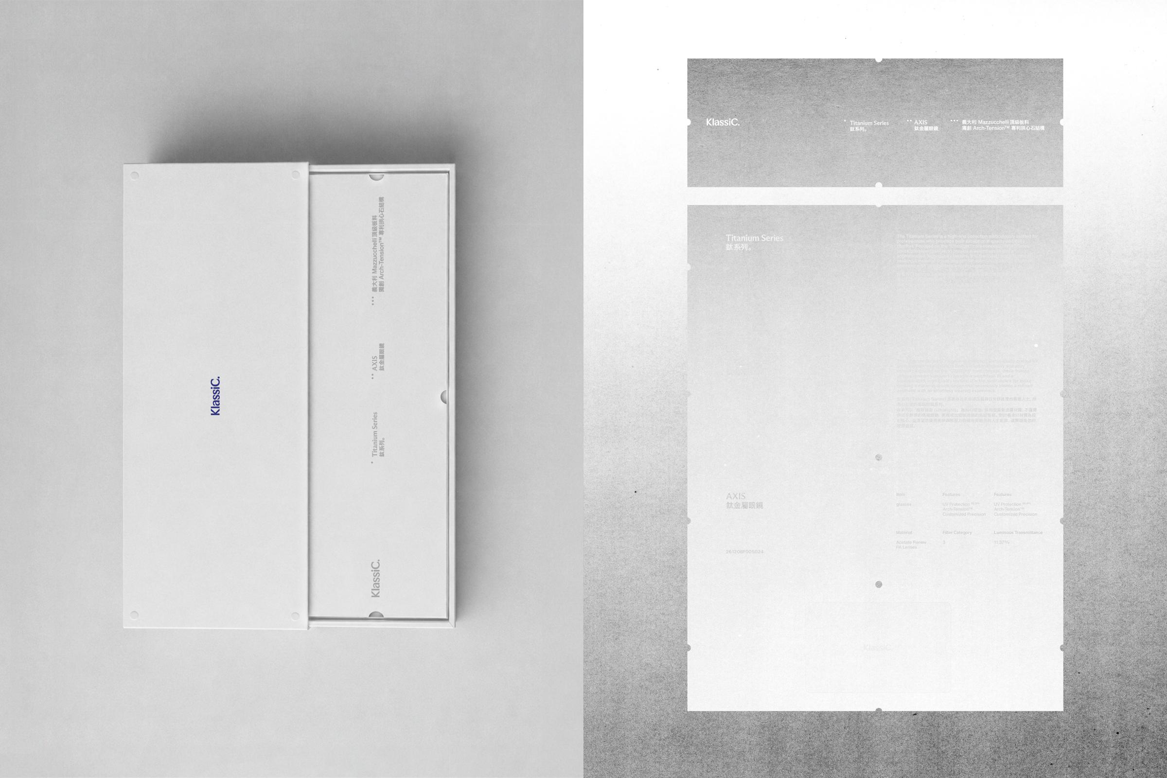
This project focused on refining the brand into a more premium and structured direction while maintaining its approachable and playful character. Orkr reorganized the symbol, logotype, color system, and overall tone & manner based on the brand’s optical and technical characteristics, preserving the recognizability and mood of the existing identity while refining its proportions and visual structure into a more contemporary system.
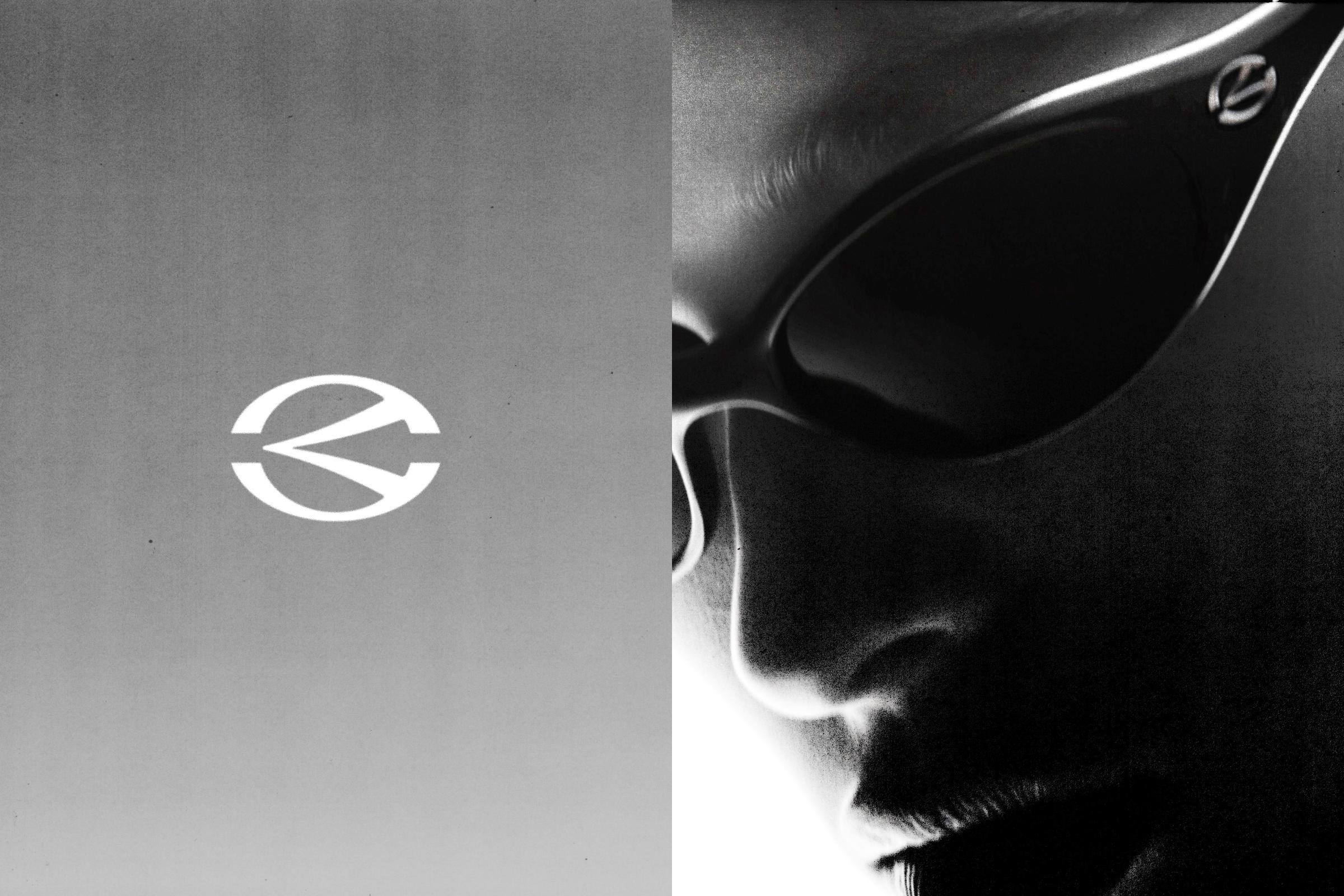
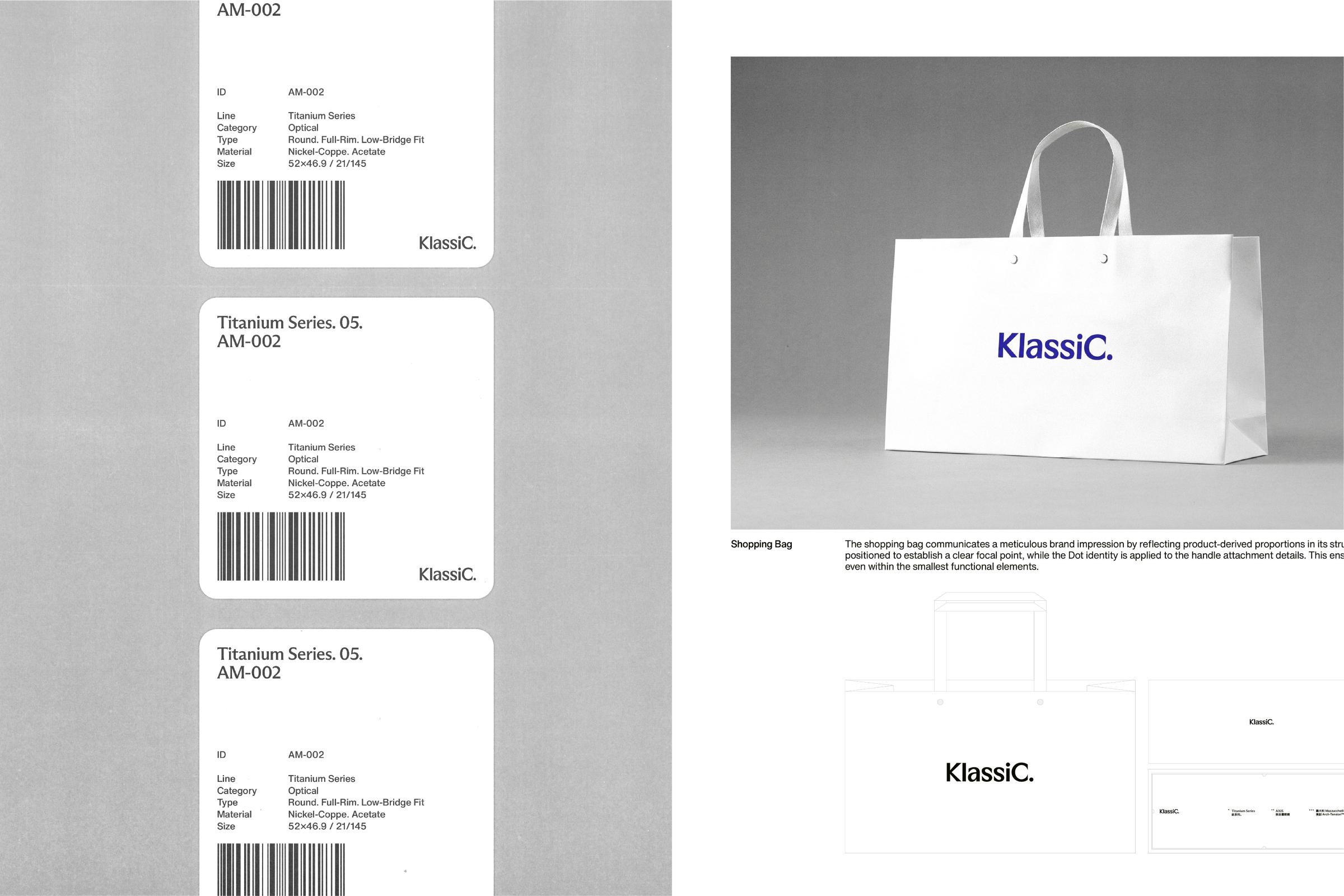
The logotype and symbol were refined to retain KlassiC’s approachable character while introducing a clearer sense of structure and balance. Through open and expanded forms, the redesign aimed to express optical depth, openness, and a more refined contemporary brand attitude.
KlassiC is a Taiwan-based eyewear brand that has built its identity through playful communication, lifestyle-driven visuals, and strong recognition centered around its signature blue color and distinctive forms.
This project focused on refining the brand into a more premium and structured direction while maintaining its approachable and playful character. Orkr reorganized the symbol, logotype, color system, and overall tone & manner based on the brand’s optical and technical characteristics, preserving the recognizability and mood of the existing identity while refining its proportions and visual structure into a more contemporary system.
The logotype and symbol were refined to retain KlassiC’s approachable character while introducing a clearer sense of structure and balance. Through open and expanded forms, the redesign aimed to express optical depth, openness, and a more refined contemporary brand attitude.
Partakers : Haam Younghoon (Creative director), Cho Eunjoo (Creative director), Kim Dabin (Project Manager), Kang Subin (Designer)