ORKR
  • Projects
  • Index
  • Info
  • ii  RESEARCH
  • 2020-24
  • Type of client
    • Corporate
    • Public
    • Entertainment
    • Fashion
    • Beauty
    • Lifestyle
    • F&B
    • Art & Culture
SEOSAN Brand Identity Design
Art direction, Brand identity, Application, Website, Photography
SEOSAN
Task scope : Full brand design
Sub task : Art directing, Graphic design
Category : Commercial
Date of completion : Jul. 2026

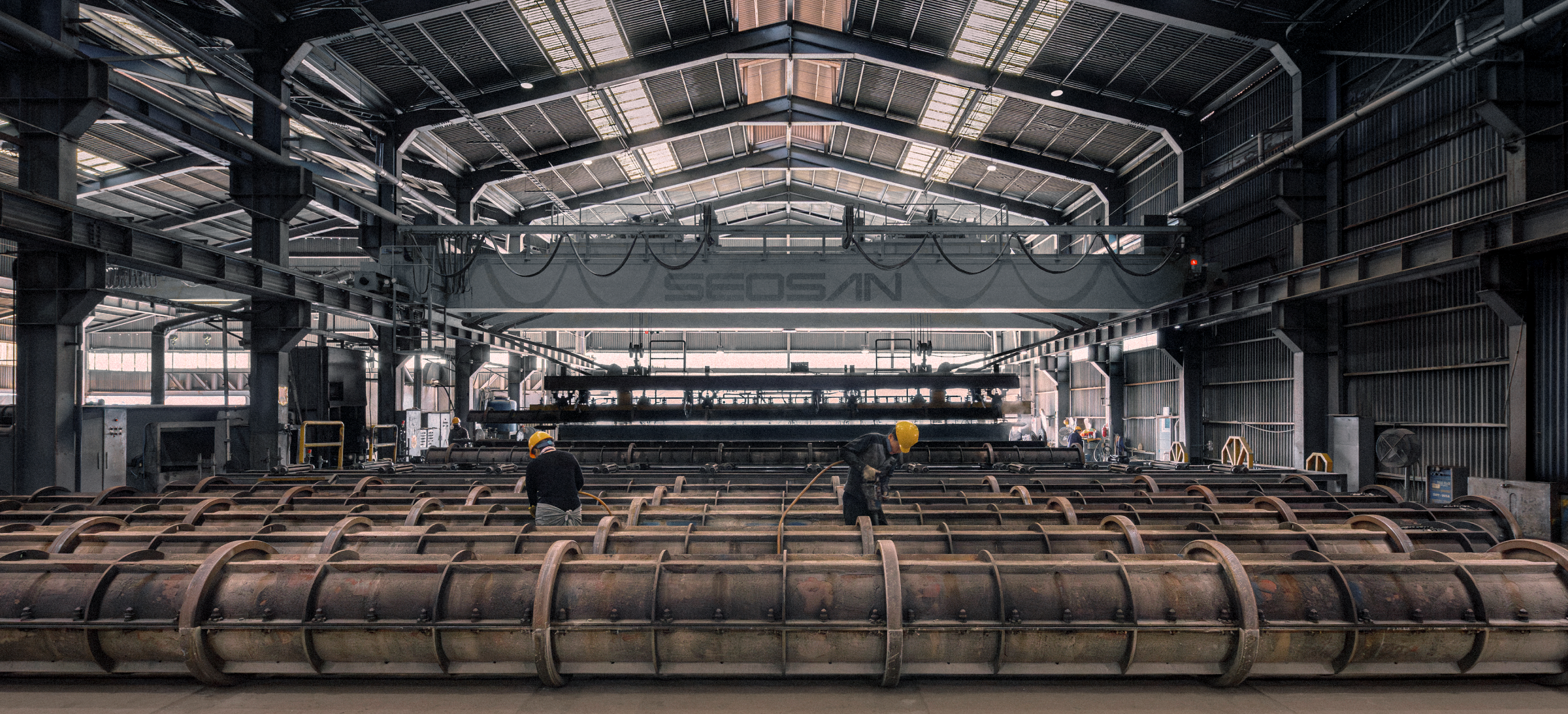
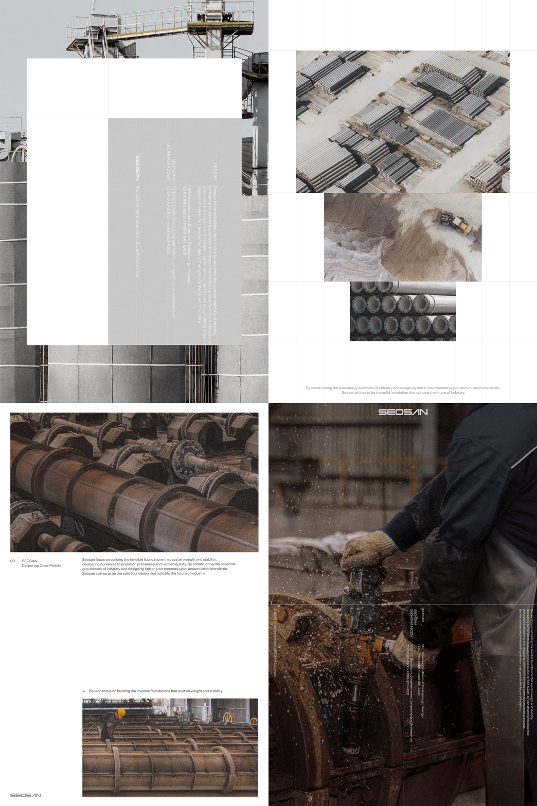
SEOSAN is a concrete industry specialist based in Gwangju, South Korea.

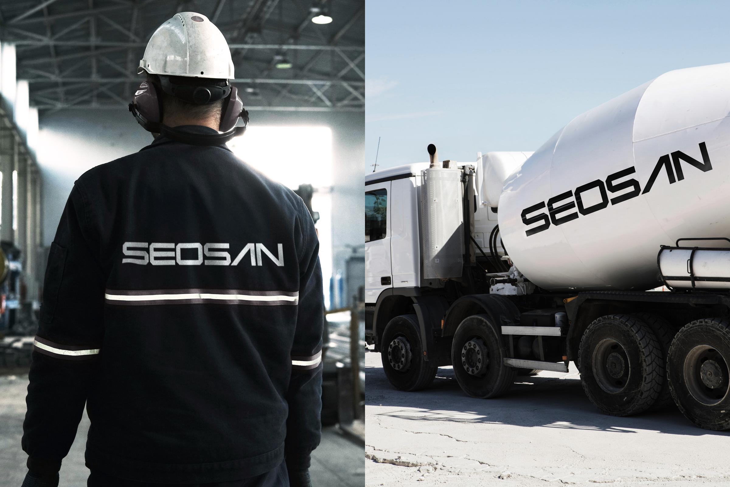
This project focused on redefining the corporate identity that SEOSAN had maintained for over 50 years, and expanding its trustworthiness and expertise into a more contemporary brand experience. While preserving the essential concepts and values of the existing identity, we reinterpreted the company’s vision and future direction through a new visual language.

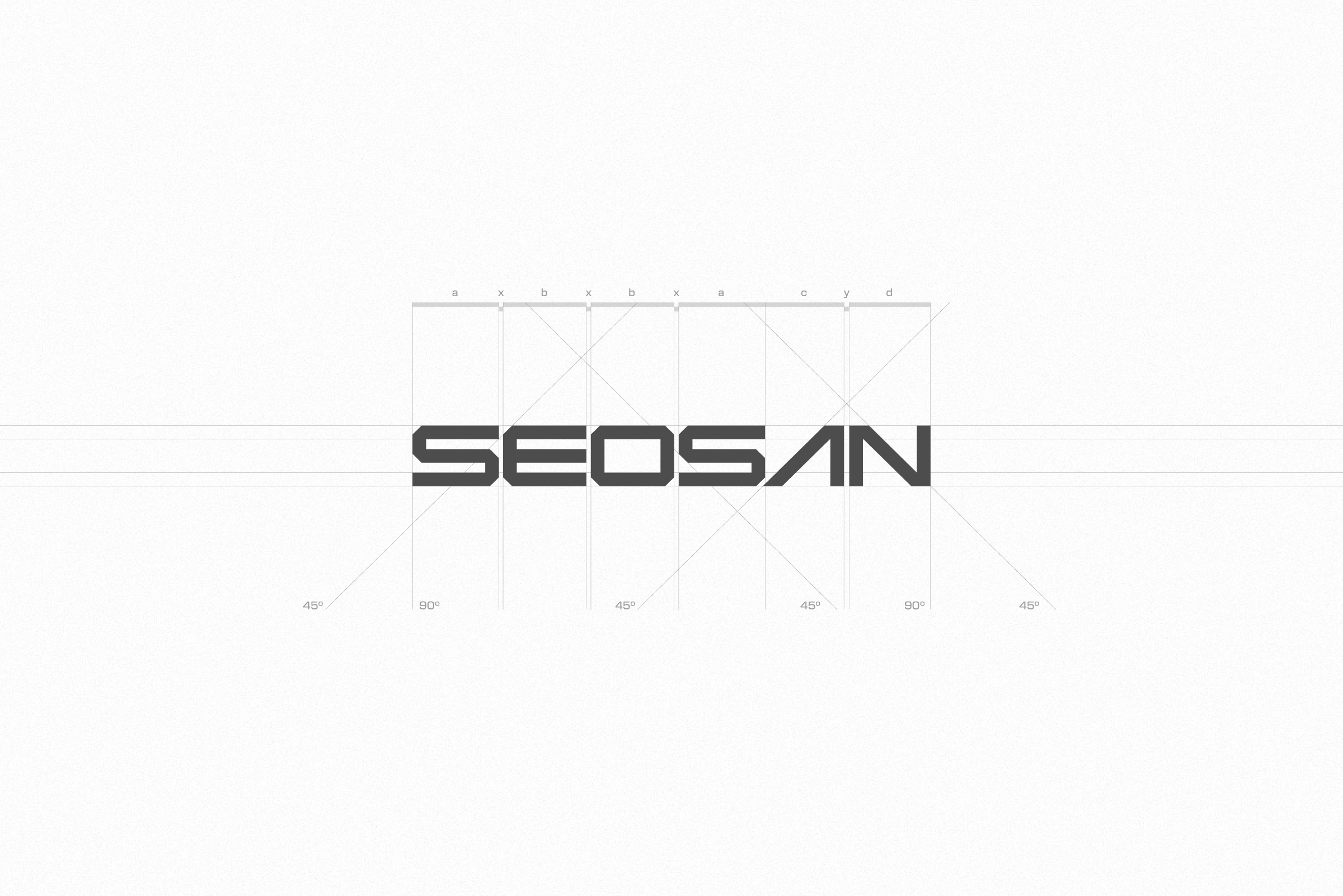
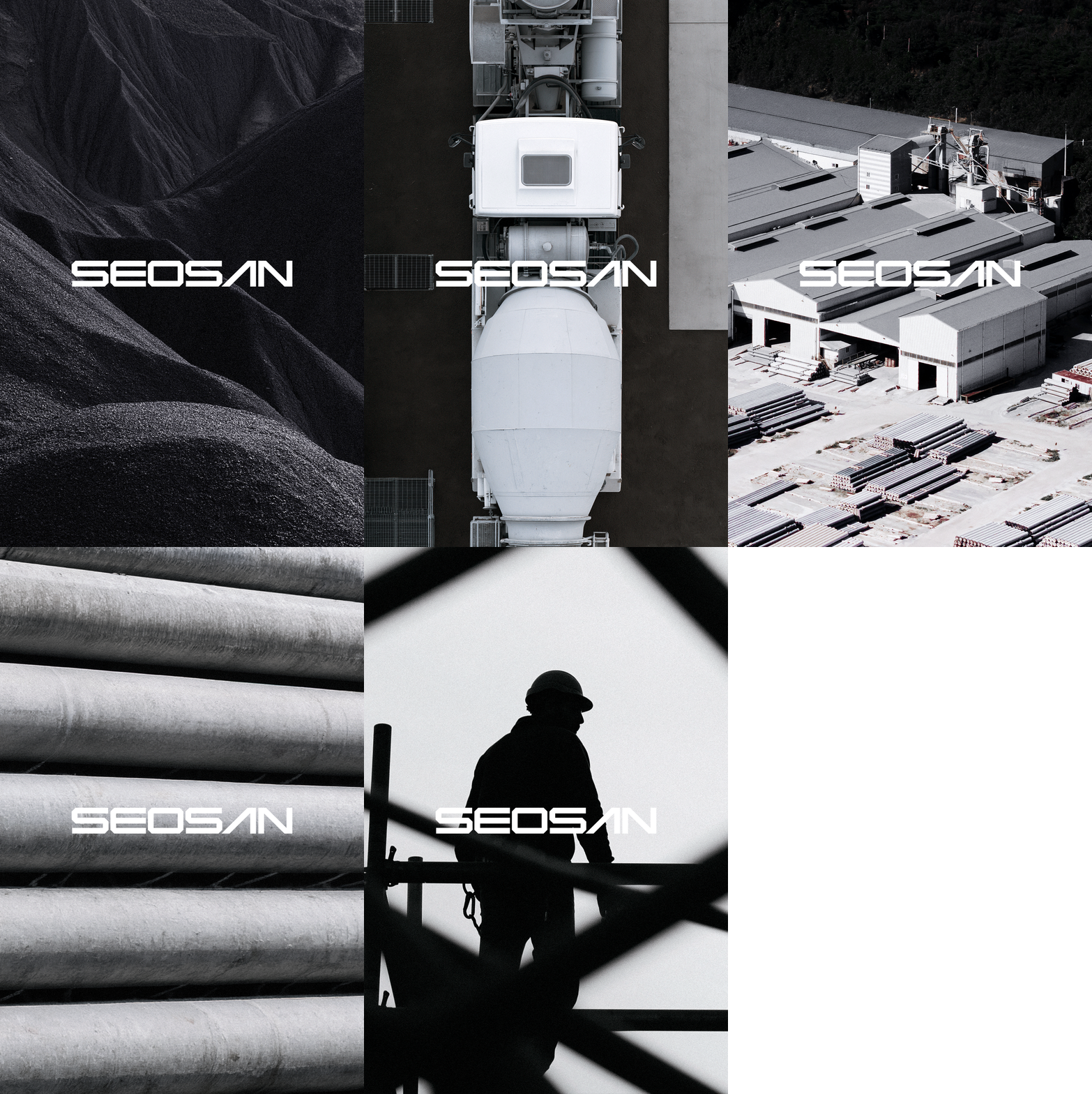
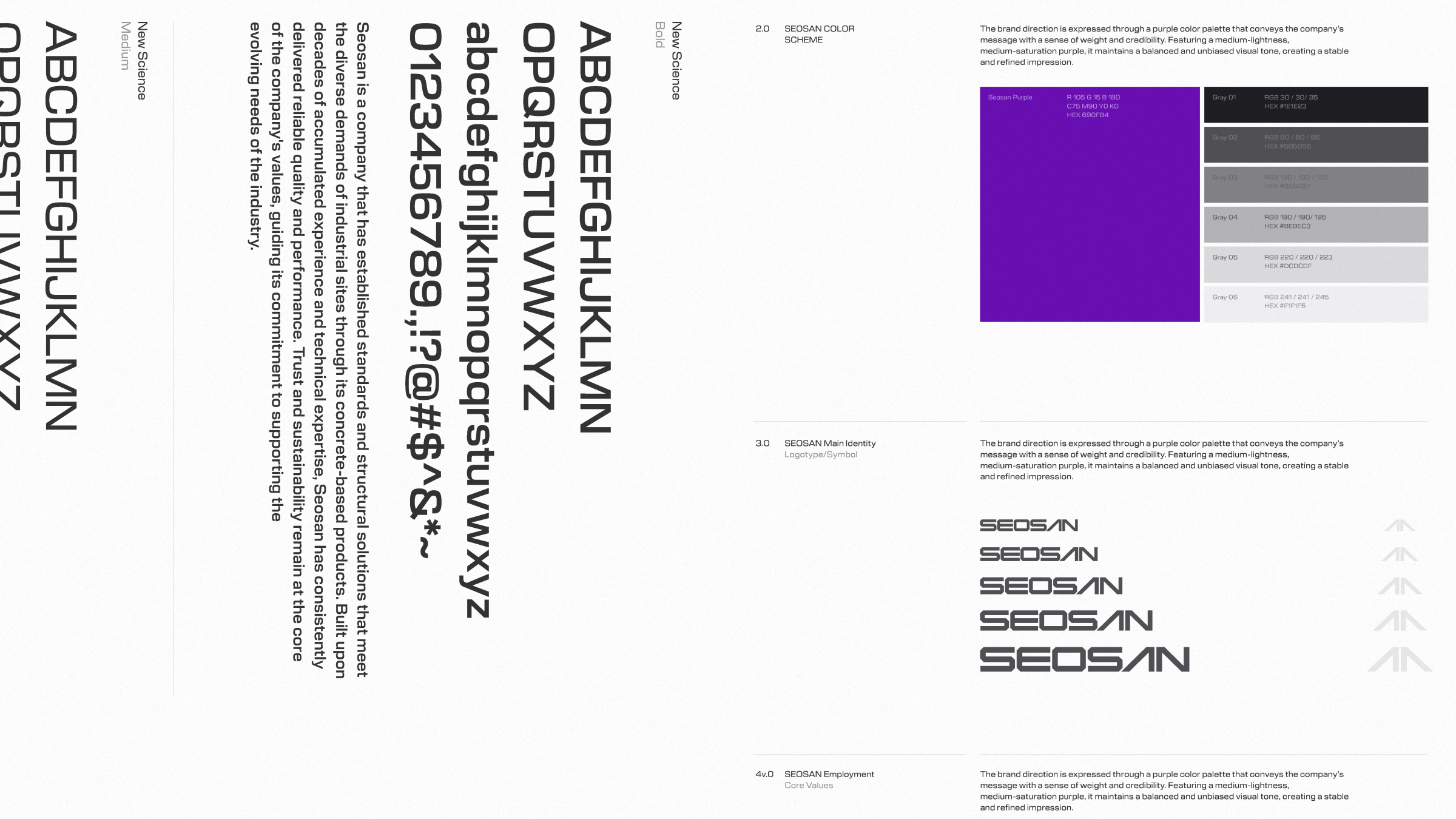
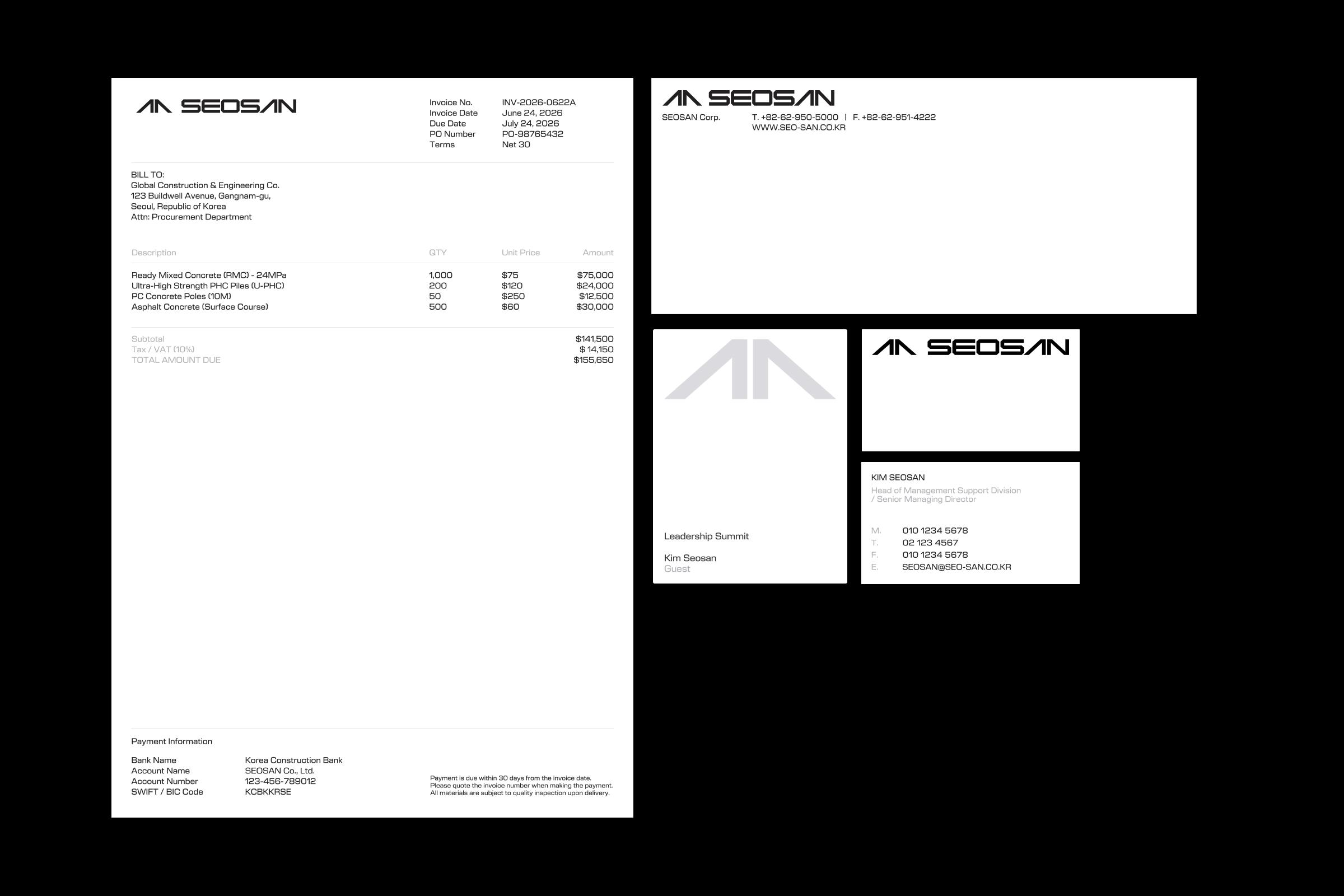
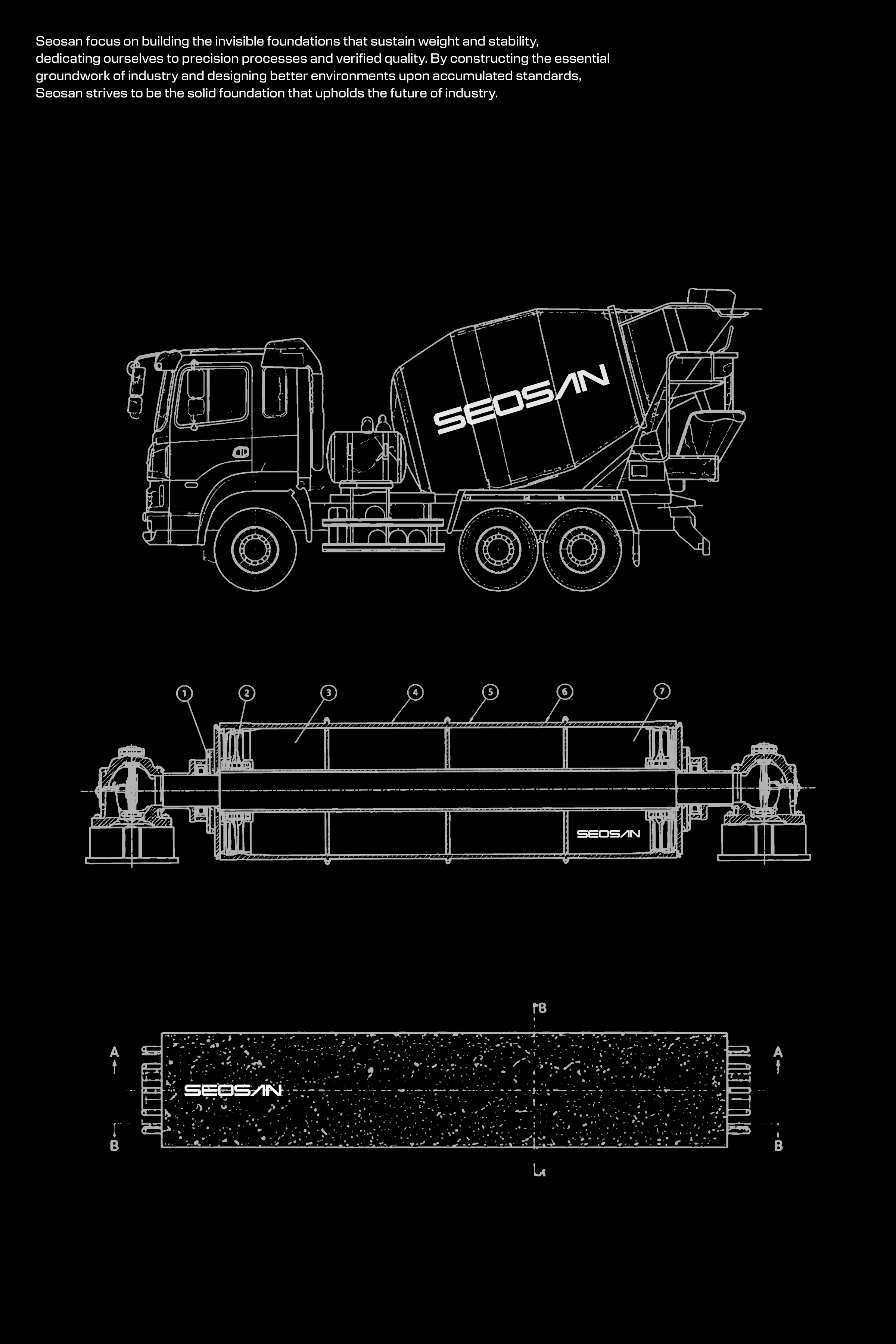
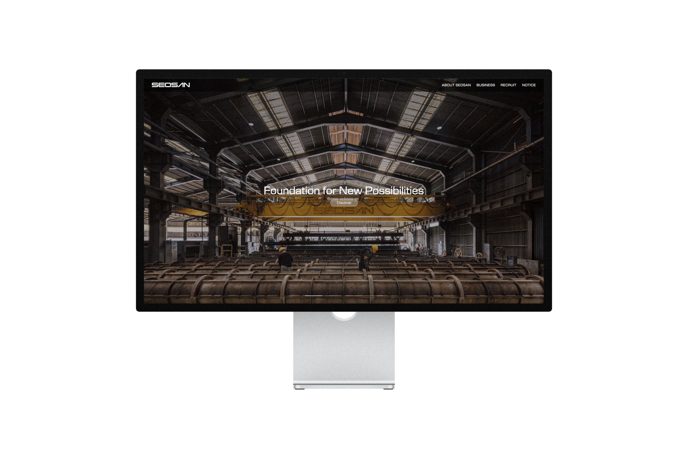
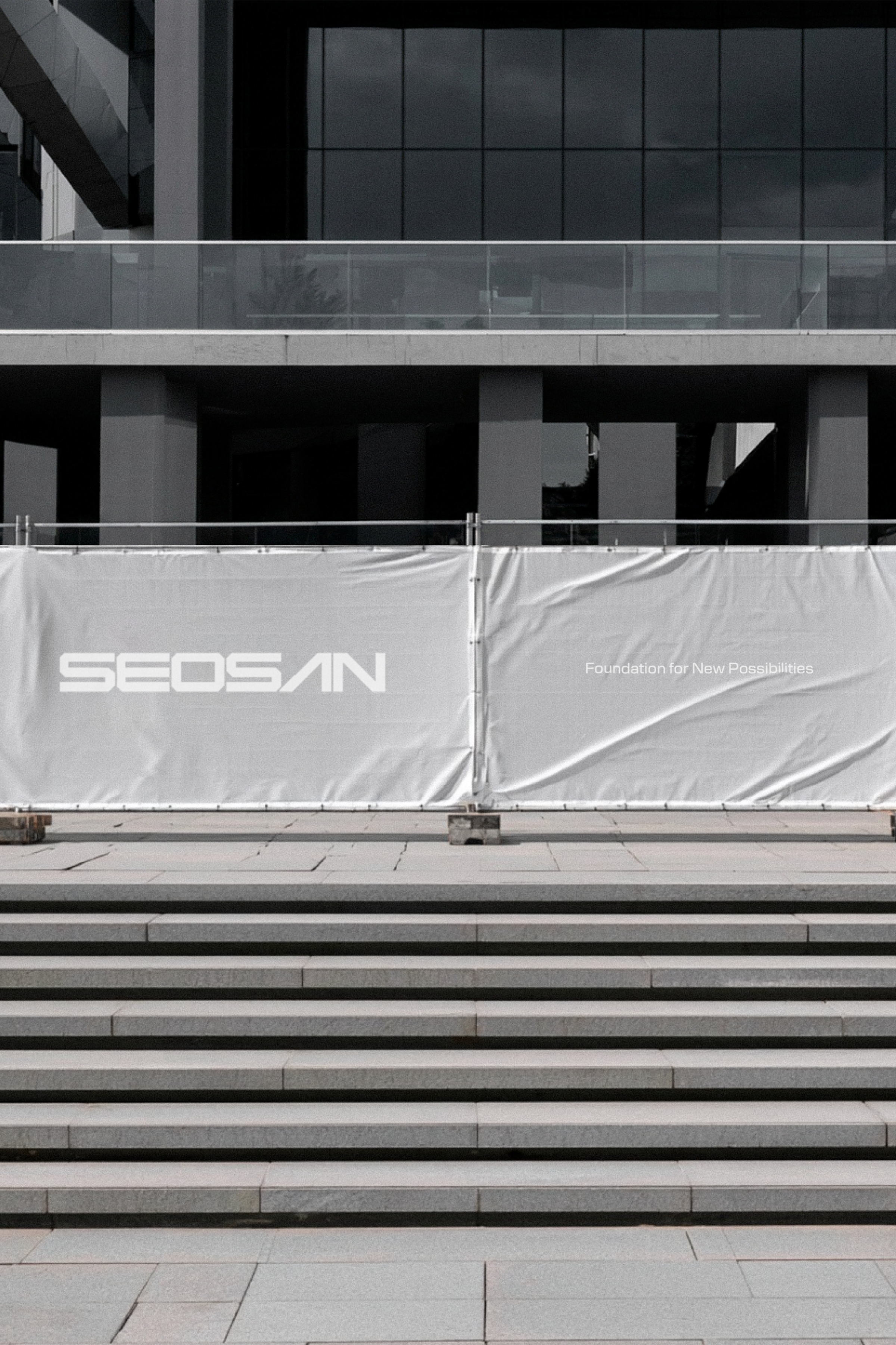
Reflecting the meaning of the corporate slogan “Foundation for New Possibilities” and the structural characteristics of its key products — RMC, Concrete Pole, PHC Pile, and ASCON — we built a solid and stable corporate identity centered around linear forms. The newly refined identity visually embodies SEOSAN’s precise production process and proven technical expertise, while consistently expressing the company’s sense of trust and solidity through SEOSAN’s signature purple color.


Partakers : Haam Younghoon (Project Leader), Jo Heungju (Project manager), Kim Dabin (Designer)

SEOSAN is a concrete industry specialist based in Gwangju, South Korea.

This project focused on redefining the corporate identity that SEOSAN had maintained for over 50 years, and expanding its trustworthiness and expertise into a more contemporary brand experience. While preserving the essential concepts and values of the existing identity, we reinterpreted the company’s vision and future direction through a new visual language.

Reflecting the meaning of the corporate slogan “Foundation for New Possibilities” and the structural characteristics of its key products — RMC, Concrete Pole, PHC Pile, and ASCON — we built a solid and stable corporate identity centered around linear forms. The newly refined identity visually embodies SEOSAN’s precise production process and proven technical expertise, while consistently expressing the company’s sense of trust and solidity through SEOSAN’s signature purple color.


Partakers : Haam Younghoon (Project Leader), Jo Heungju (Project manager), Kim Dabin (Designer)
Next Project
Back to list

SEOSAN is a concrete industry specialist based in Gwangju, South Korea.

This project focused on redefining the corporate identity that SEOSAN had maintained for over 50 years, and expanding its trustworthiness and expertise into a more contemporary brand experience. While preserving the essential concepts and values of the existing identity, we reinterpreted the company’s vision and future direction through a new visual language.

Reflecting the meaning of the corporate slogan “Foundation for New Possibilities” and the structural characteristics of its key products — RMC, Concrete Pole, PHC Pile, and ASCON — we built a solid and stable corporate identity centered around linear forms. The newly refined identity visually embodies SEOSAN’s precise production process and proven technical expertise, while consistently expressing the company’s sense of trust and solidity through SEOSAN’s signature purple color.


Partakers : Haam Younghoon (Project Leader), Jo Heungju (Project manager), Kim Dabin (Designer)
Founded in 2020, orkr is a brand design consultancy based in south korea
(C) ORKR
SNS