ORKR
  • Projects
  • Index
  • Info
  • ii  RESEARCH
  • 2020-24
  • Type of client
    • Corporate
    • Public
    • Entertainment
    • Fashion
    • Beauty
    • Lifestyle
    • F&B
    • Art & Culture
OSULLOC MASTER’S MATCHA & MATCHA PLUS Package Design
Art direction, Brand identity, Pictogram, Application, Package
OSULLOC
Task scope : Partial scope brand design
Sub task : Art directing, Graphic design
Category : Commercial
Date of completion : Aug. 2026

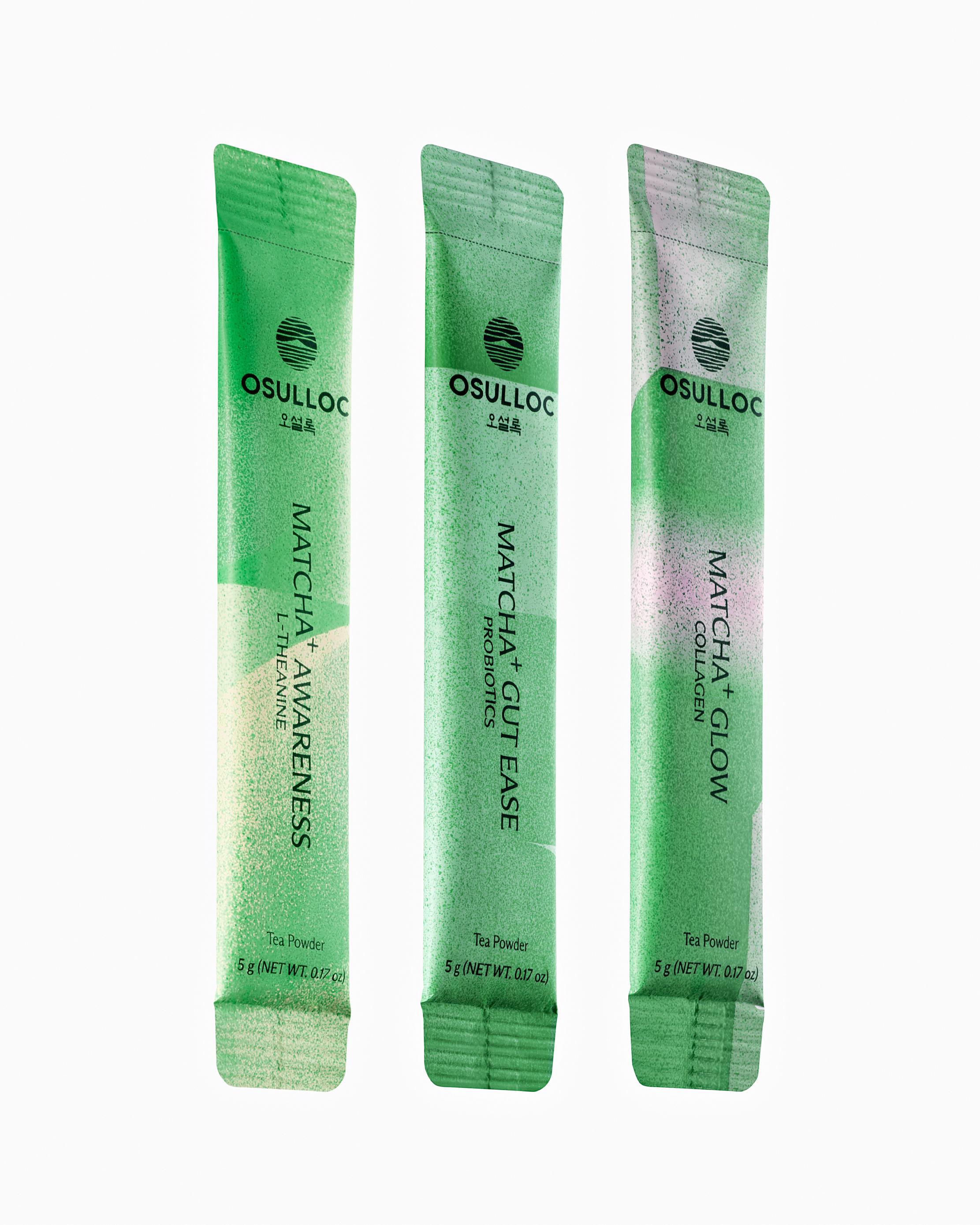
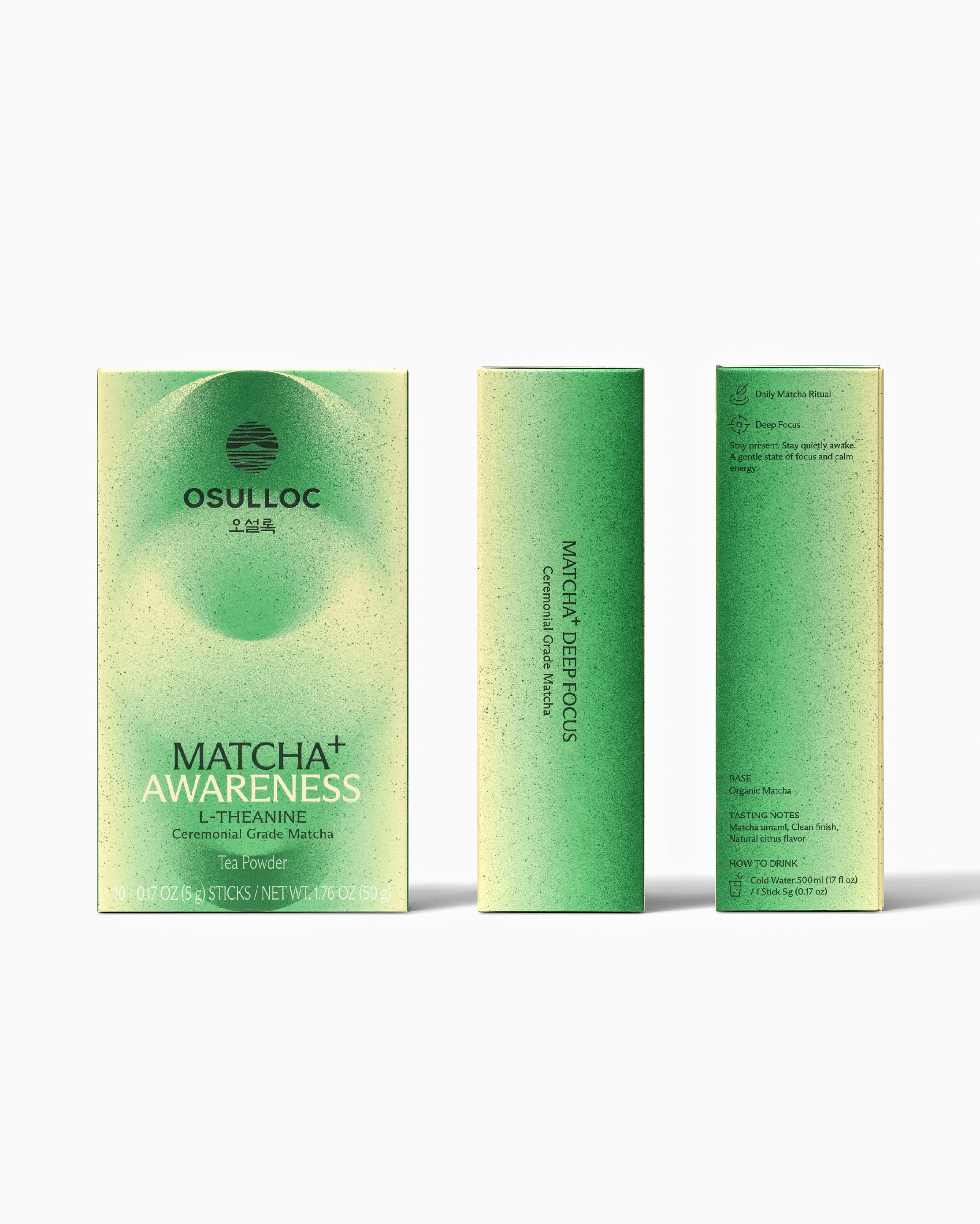
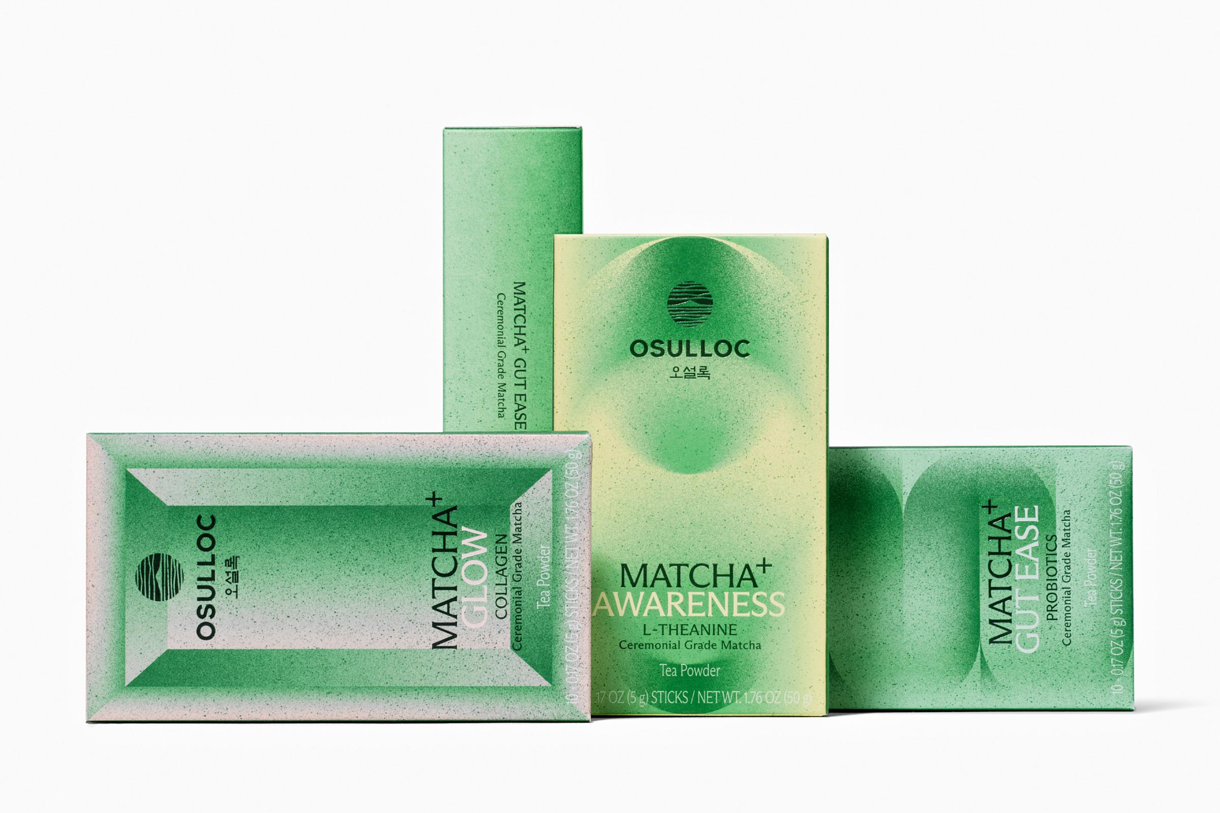
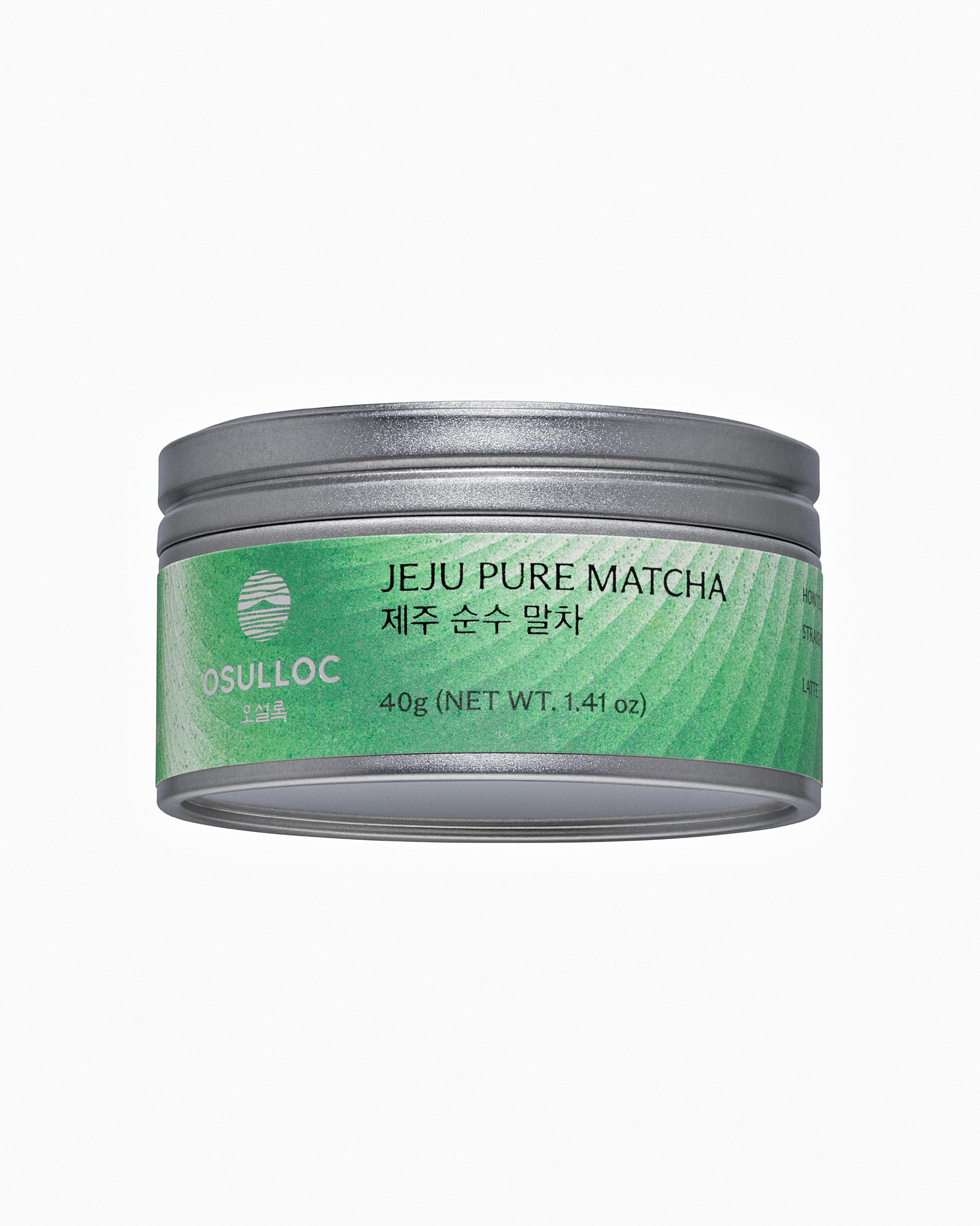
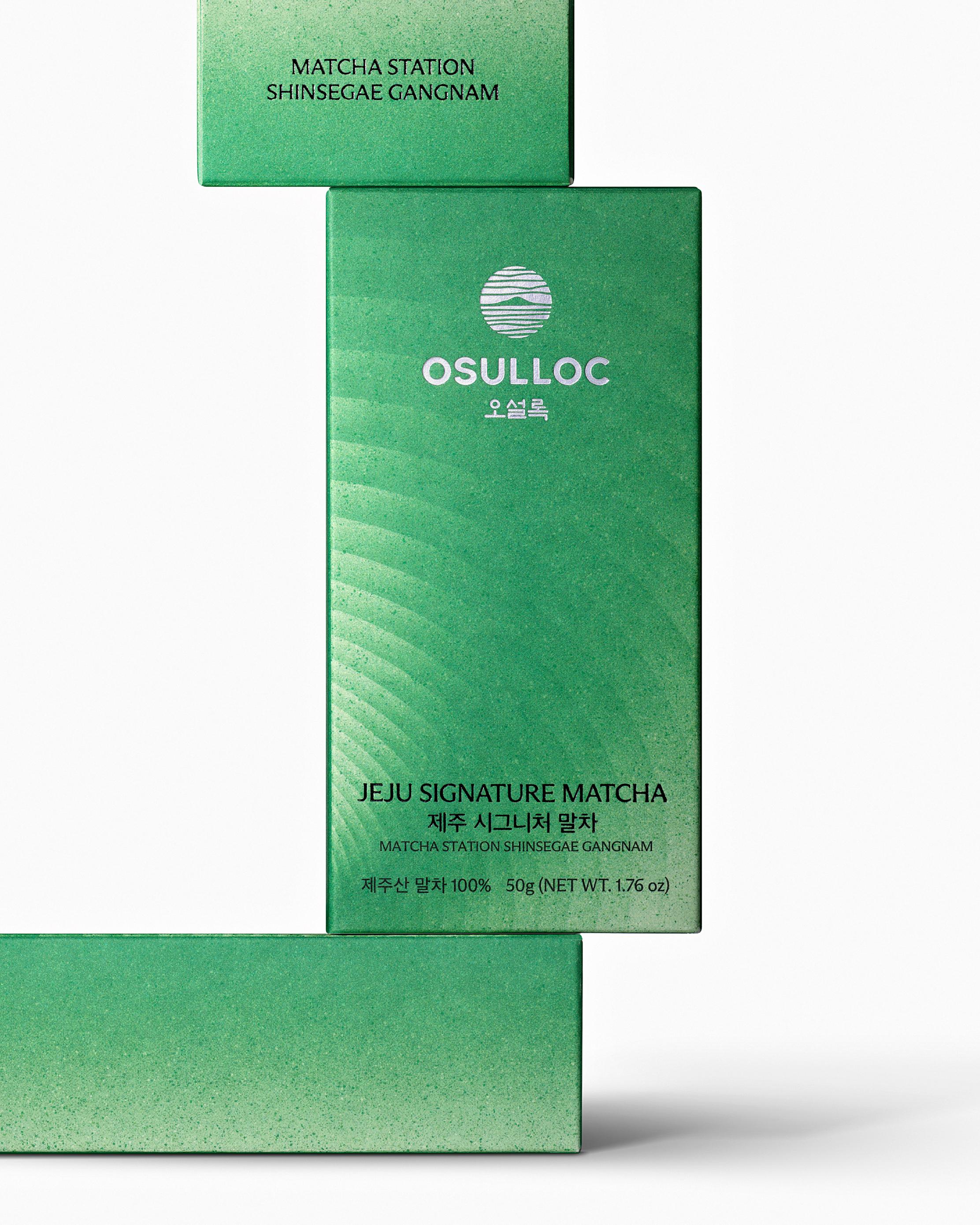
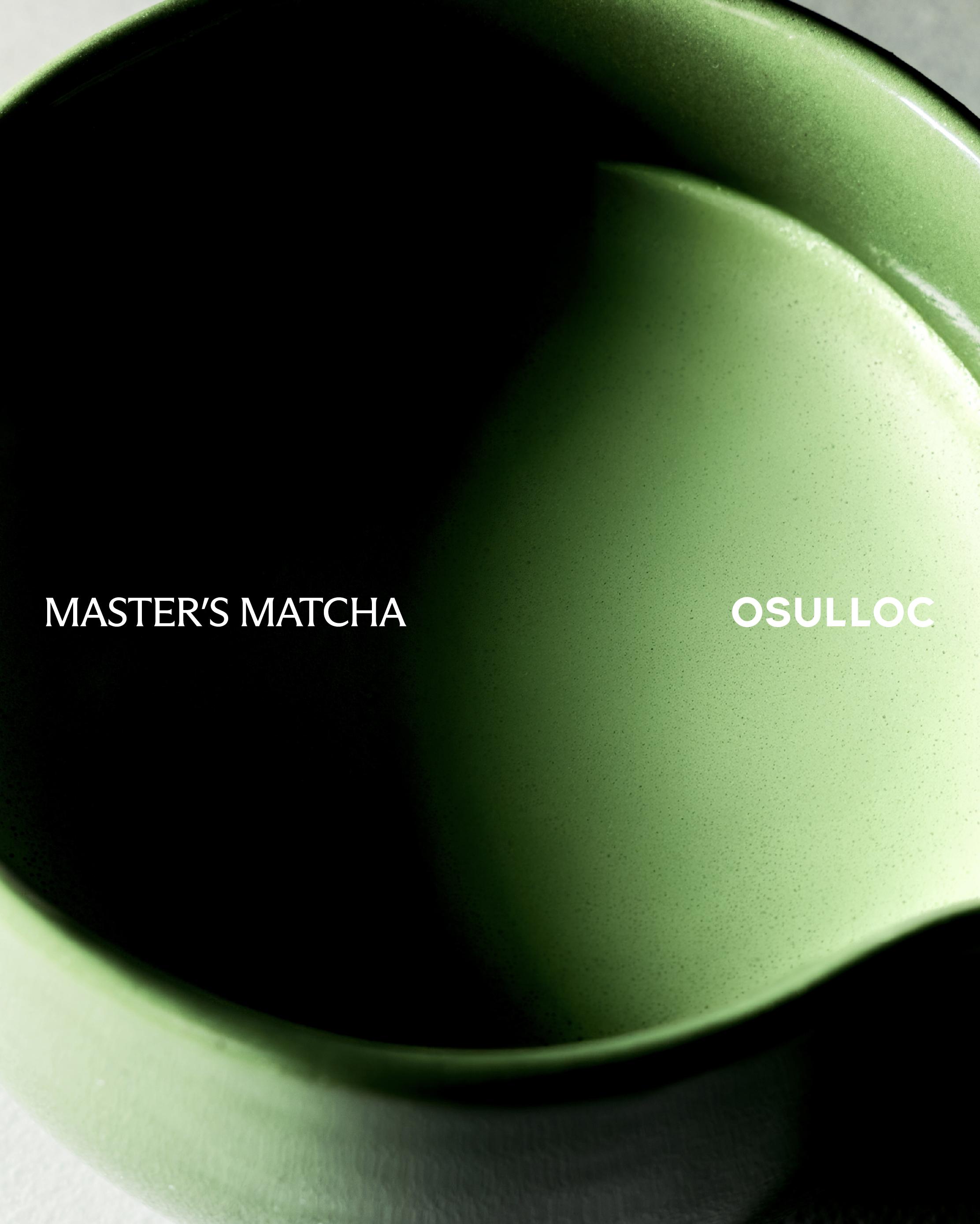
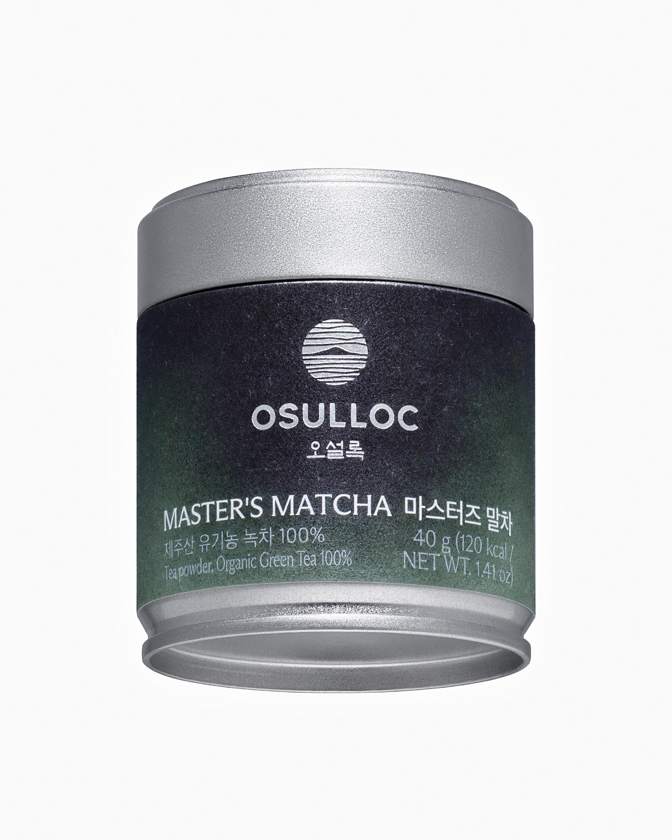
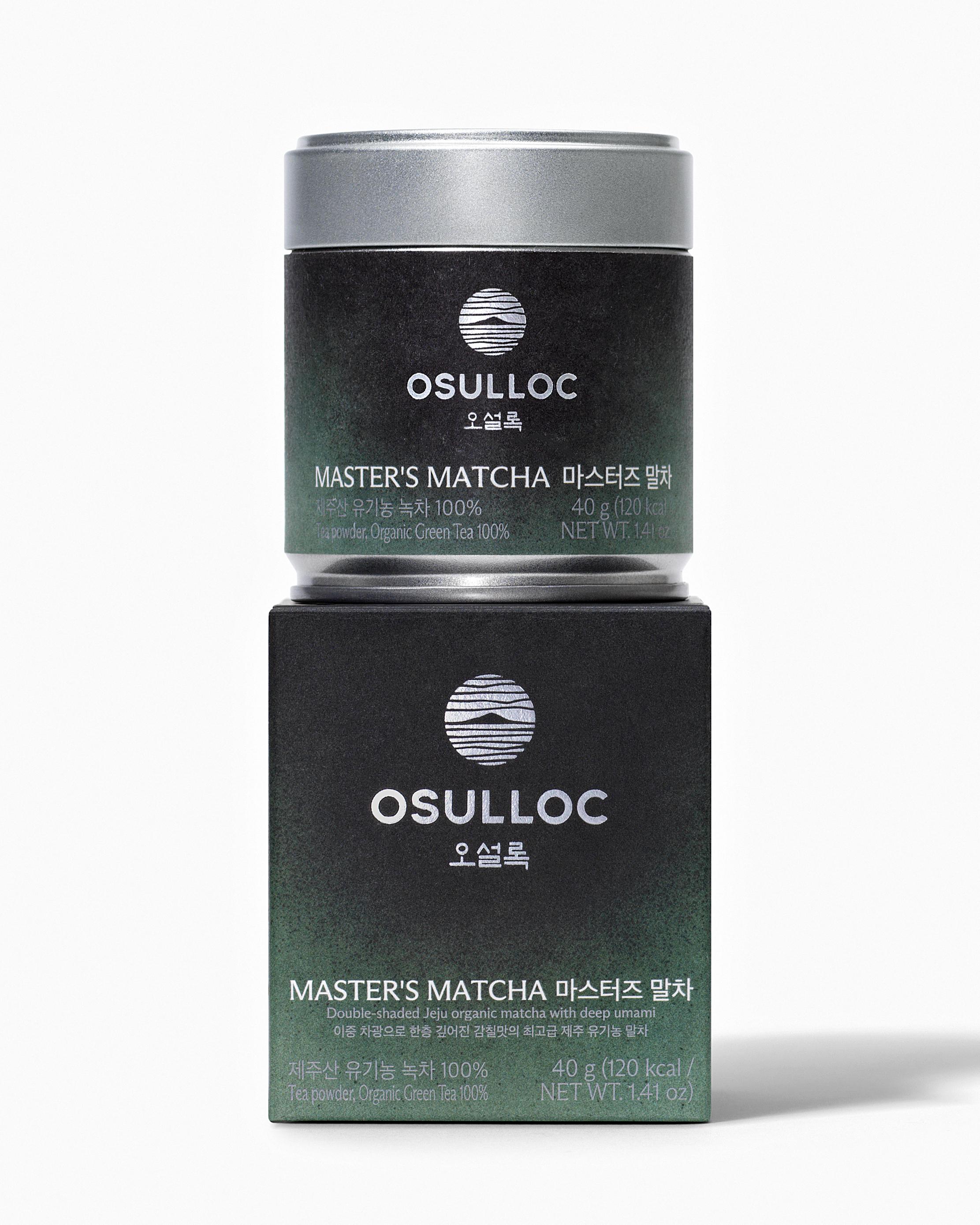
We designed the packaging for “MASTER’S MATCHA” and “MATCHA PLUS,” new products in the OSULLOC Matcha line. MASTER’S MATCHA is a premium Jeju organic matcha that delivers a deeper, richer umami flavor thanks to double shading, while MATCHA PLUS is a product that can be enjoyed conveniently without whisking, retains the authentic flavor of matcha, and features added fruit notes for a refreshing taste.

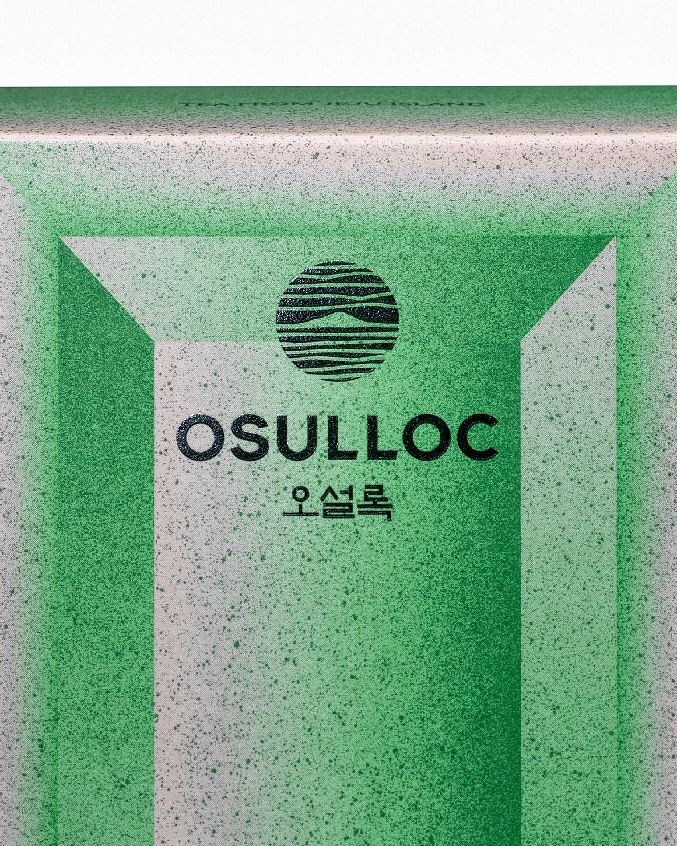
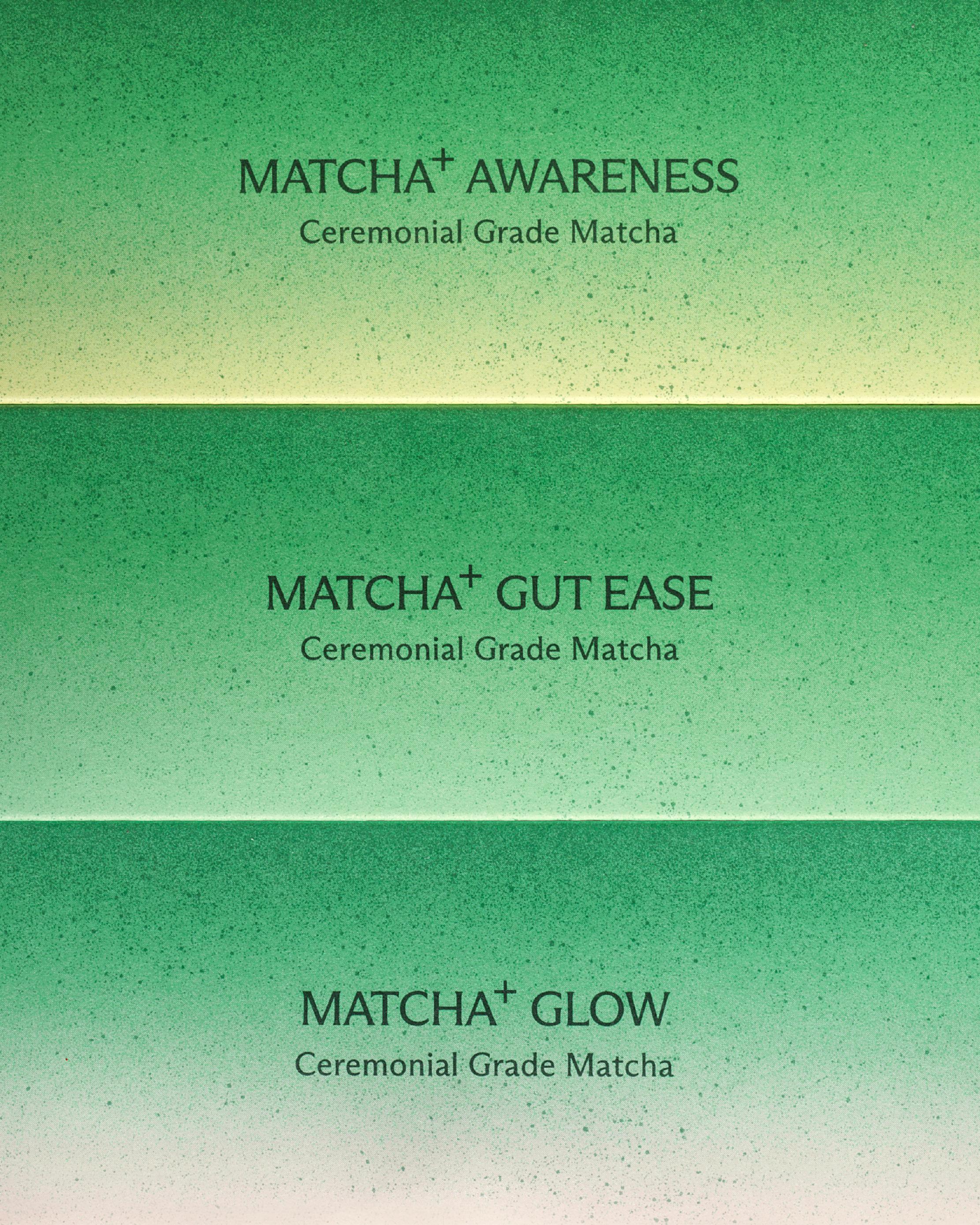
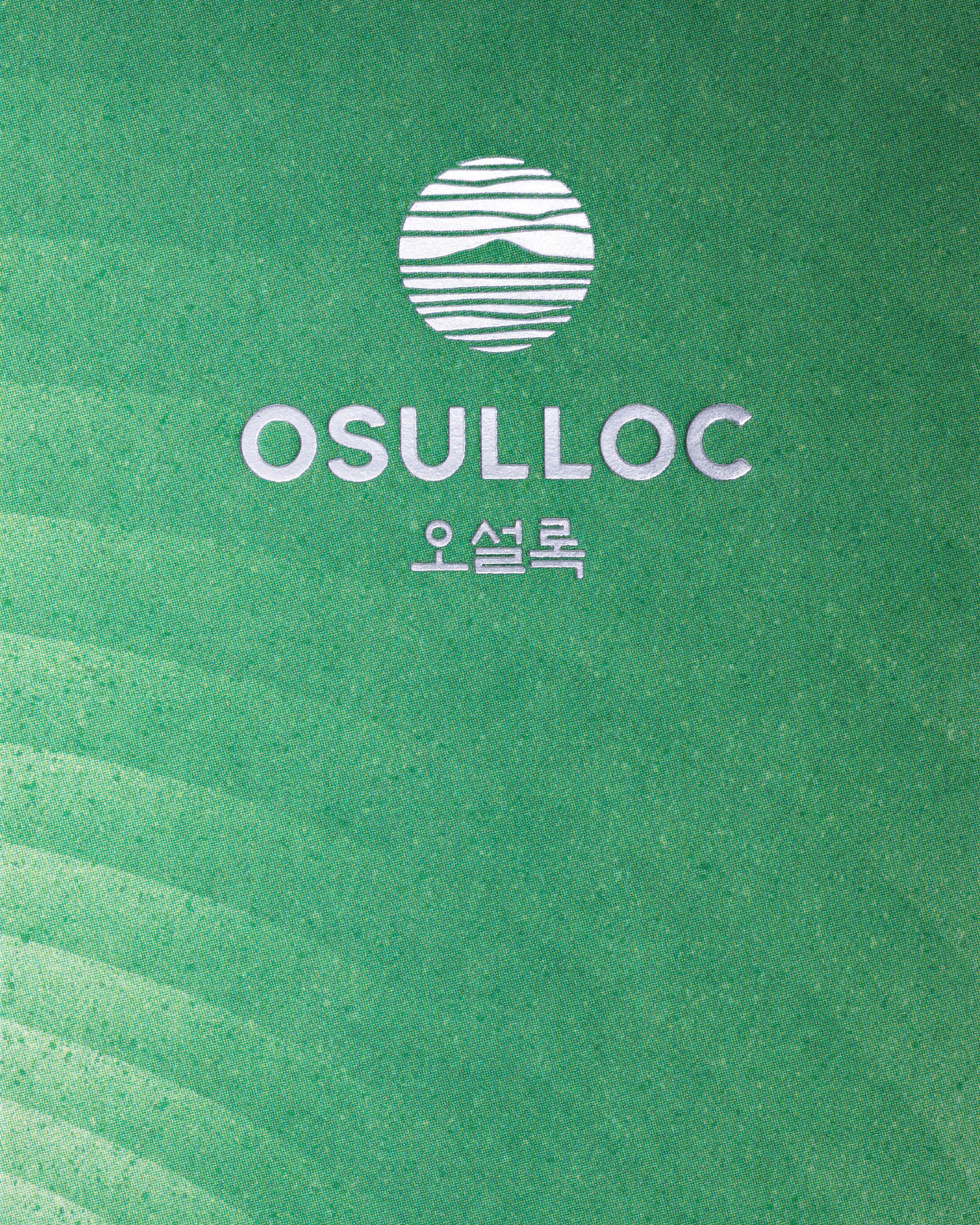
Overall, we incorporated the particle texture of matcha powder into the entire graphic design. For “MASTER’S MATCHA,” which allows consumers to enjoy matcha as it is after roasting, we intuitively depicted the roasting process. For “MATCHA PLUS,” we expressed each product’s functional characteristics through intuitive graphics. In particular, we focused on establishing a differentiated hierarchy between the two lines based on matcha grade. We developed “MASTER’S MATCHA” with a luxurious look that emphasizes the product’s premium qualities, while “MATCHA PLUS” was designed with a trendier and more casual aesthetic, ensuring that the character and positioning of each line are intuitively conveyed.


Partakers : Haam Younghoon (Project Leader), Jin Hansol [Project manager], Jeong Youngsun (Graphic Designer), Kim Dabin [Graphic Designer], Kang Subin [Graphic Designer]

We designed the packaging for “MASTER’S MATCHA” and “MATCHA PLUS,” new products in the OSULLOC Matcha line. MASTER’S MATCHA is a premium Jeju organic matcha that delivers a deeper, richer umami flavor thanks to double shading, while MATCHA PLUS is a product that can be enjoyed conveniently without whisking, retains the authentic flavor of matcha, and features added fruit notes for a refreshing taste.

Overall, we incorporated the particle texture of matcha powder into the entire graphic design. For “MASTER’S MATCHA,” which allows consumers to enjoy matcha as it is after roasting, we intuitively depicted the roasting process. For “MATCHA PLUS,” we expressed each product’s functional characteristics through intuitive graphics. In particular, we focused on establishing a differentiated hierarchy between the two lines based on matcha grade. We developed “MASTER’S MATCHA” with a luxurious look that emphasizes the product’s premium qualities, while “MATCHA PLUS” was designed with a trendier and more casual aesthetic, ensuring that the character and positioning of each line are intuitively conveyed.


Partakers : Haam Younghoon (Project Leader), Jin Hansol [Project manager], Jeong Youngsun (Graphic Designer), Kim Dabin [Graphic Designer], Kang Subin [Graphic Designer]
Next Project
Back to list

We designed the packaging for “MASTER’S MATCHA” and “MATCHA PLUS,” new products in the OSULLOC Matcha line. MASTER’S MATCHA is a premium Jeju organic matcha that delivers a deeper, richer umami flavor thanks to double shading, while MATCHA PLUS is a product that can be enjoyed conveniently without whisking, retains the authentic flavor of matcha, and features added fruit notes for a refreshing taste.

Overall, we incorporated the particle texture of matcha powder into the entire graphic design. For “MASTER’S MATCHA,” which allows consumers to enjoy matcha as it is after roasting, we intuitively depicted the roasting process. For “MATCHA PLUS,” we expressed each product’s functional characteristics through intuitive graphics. In particular, we focused on establishing a differentiated hierarchy between the two lines based on matcha grade. We developed “MASTER’S MATCHA” with a luxurious look that emphasizes the product’s premium qualities, while “MATCHA PLUS” was designed with a trendier and more casual aesthetic, ensuring that the character and positioning of each line are intuitively conveyed.


Partakers : Haam Younghoon (Project Leader), Jin Hansol [Project manager], Jeong Youngsun (Graphic Designer), Kim Dabin [Graphic Designer], Kang Subin [Graphic Designer]
Founded in 2020, orkr is a brand design consultancy based in south korea
(C) ORKR
SNS