
ORKR
  • Projects
  • Index
  • Info
  • ii  RESEARCH
  • 2020-26
  • Art & Culture
    • Corporate
    • Public
    • Entertainment
    • Fashion
    • Beauty
    • Lifestyle
    • F&B
    • Art & Culture
CELLVISION Brand Identity Design
Art direction, Brand identity, Application, Package
CELLVISION
Task scope : Full brand design
Sub task : Art directing, Graphic design
Category : Commercial
Date of completion : Sep. 2026

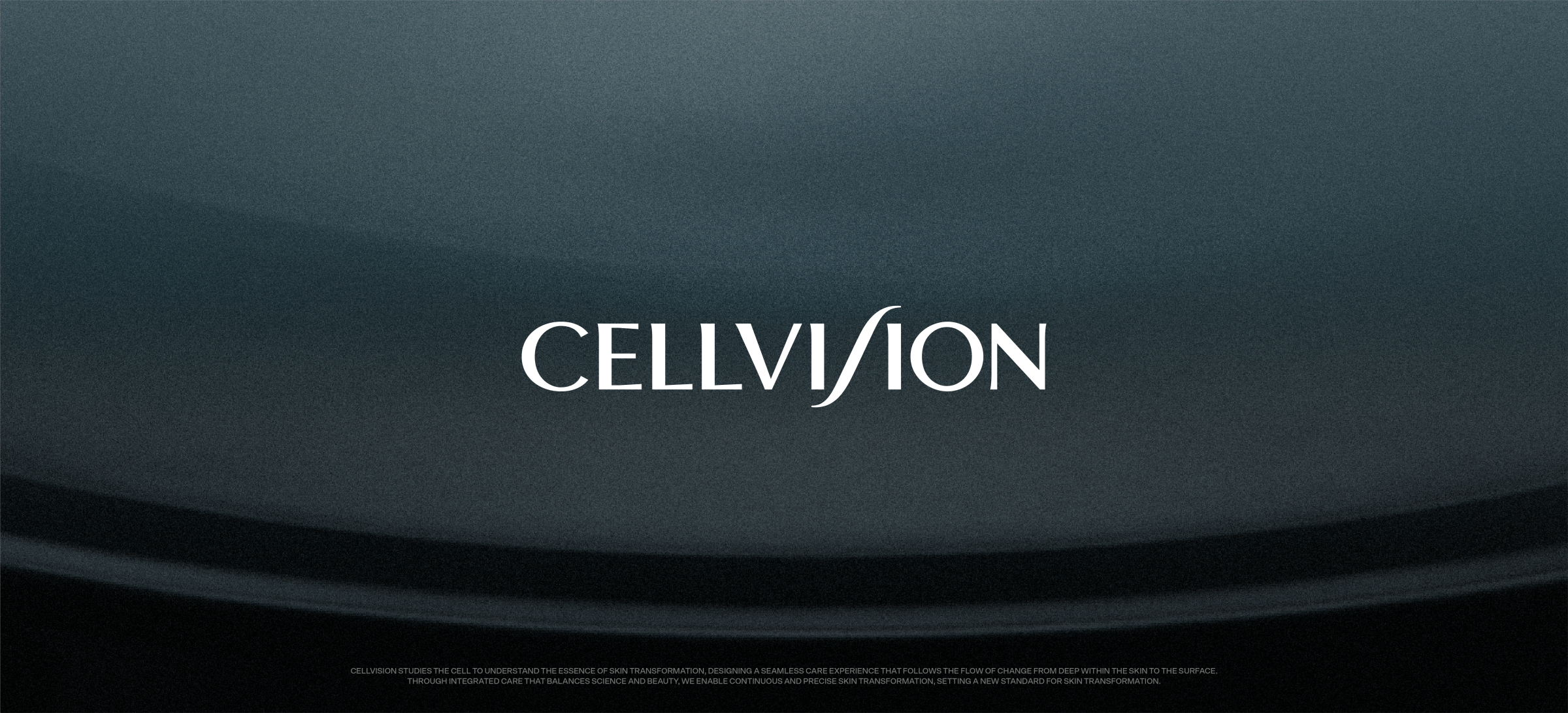
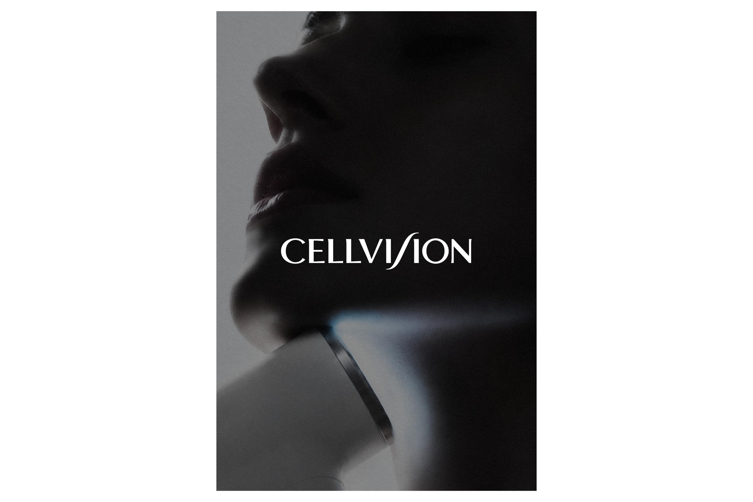
CELLVISION is a total beauty care brand that focuses on the cells where skin transformation begins, offering integrated skincare solutions that connect beauty devices with skincare products.

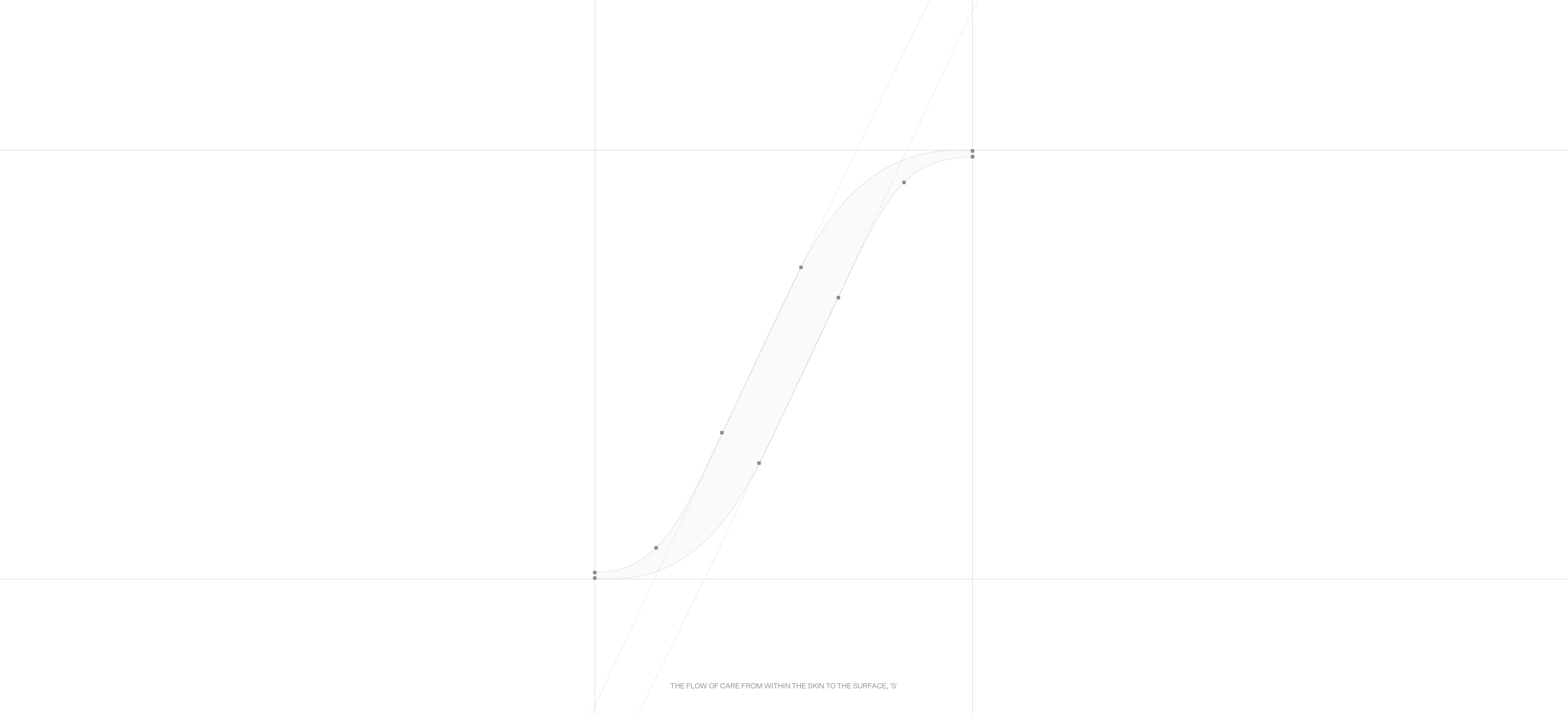
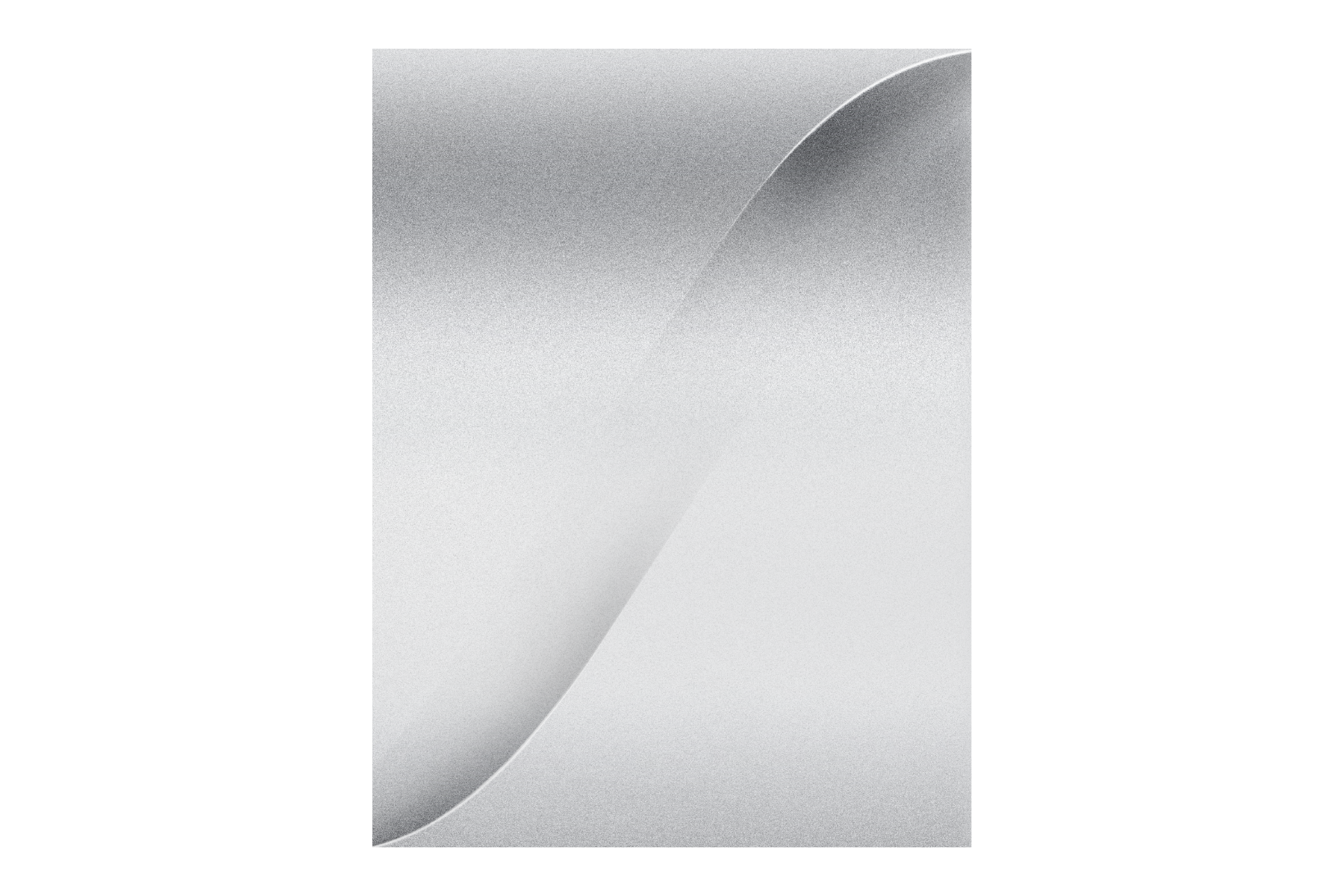
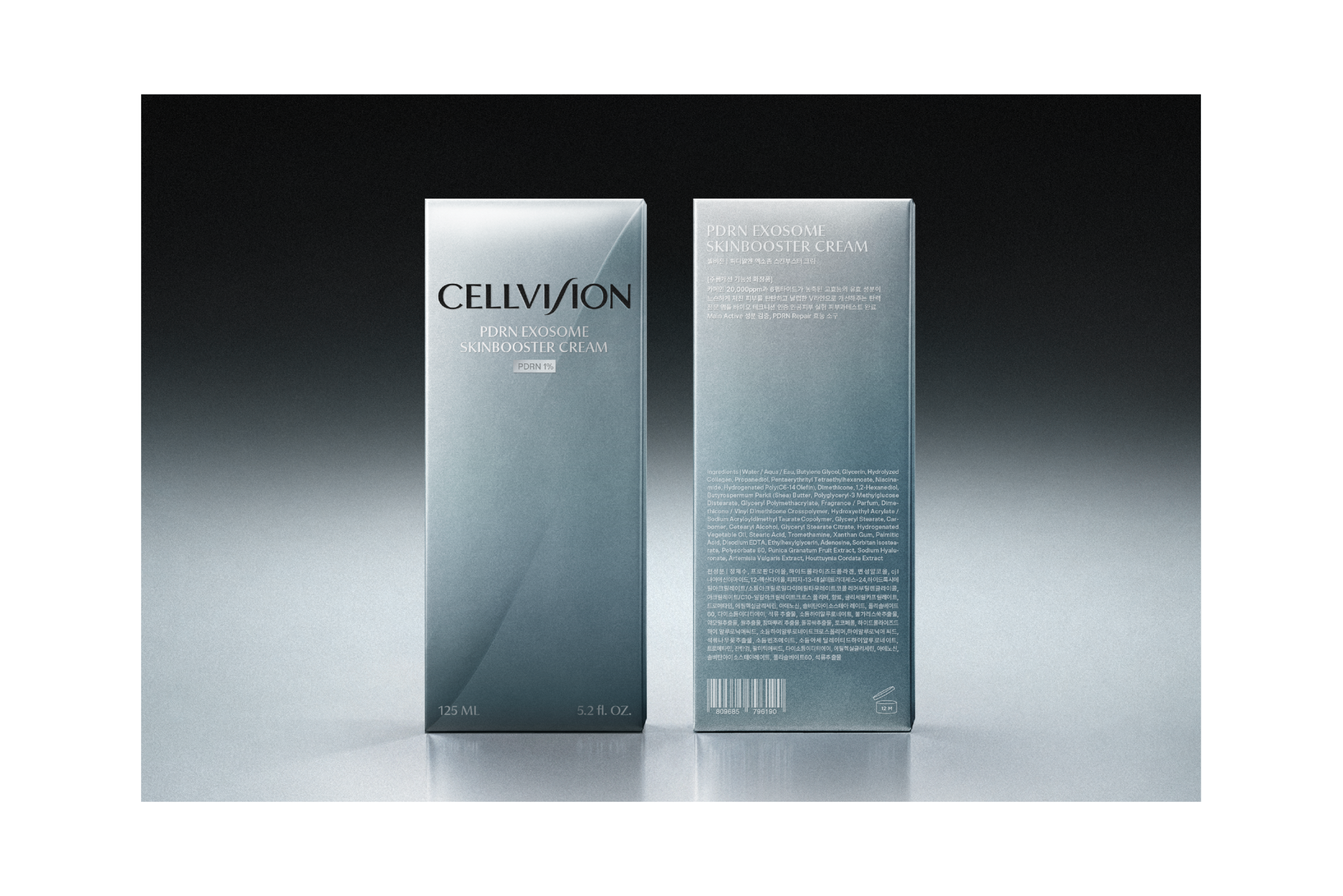
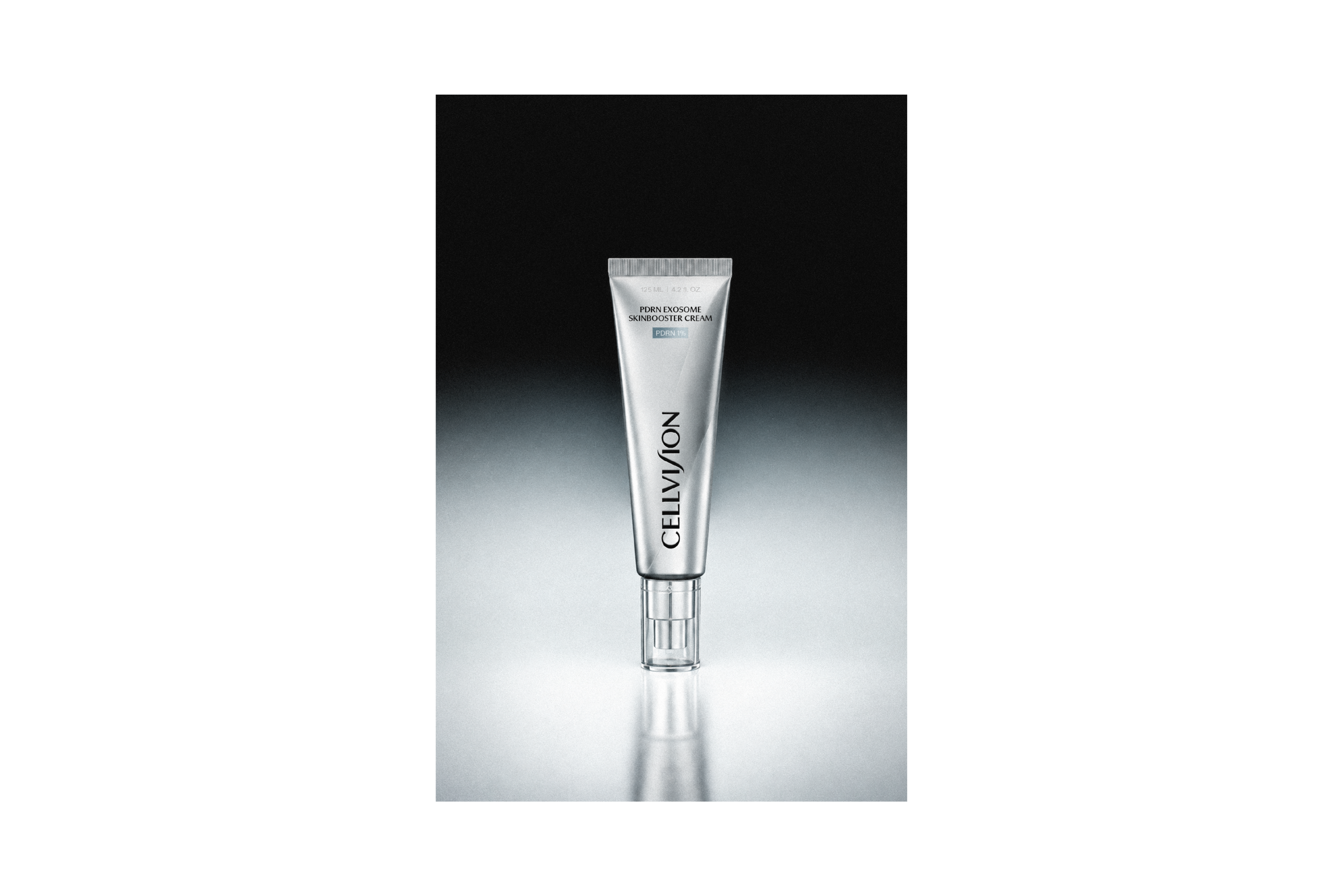
This project aimed to translate the brand’s combination of scientific technology and delicate skincare into a cohesive visual language, using cells deep within the skin—the starting point of transformation—and the flow of care extending to the skin’s surface as key motifs. The circular characteristics of cells are reflected in the C and O of the logotype, expressing a scientific perspective focused on the essence of skin transformation, while the S motif represents the flow of care from deep within the skin to its surface.

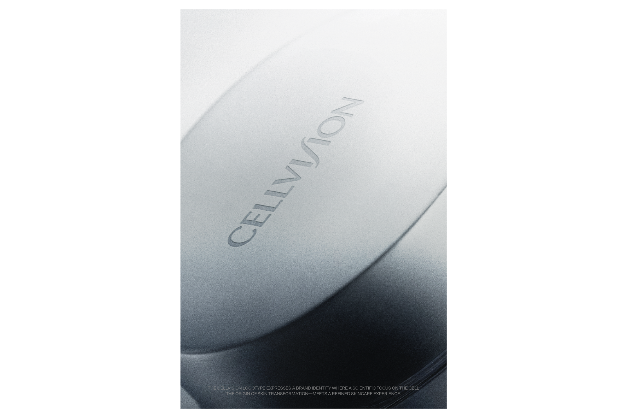
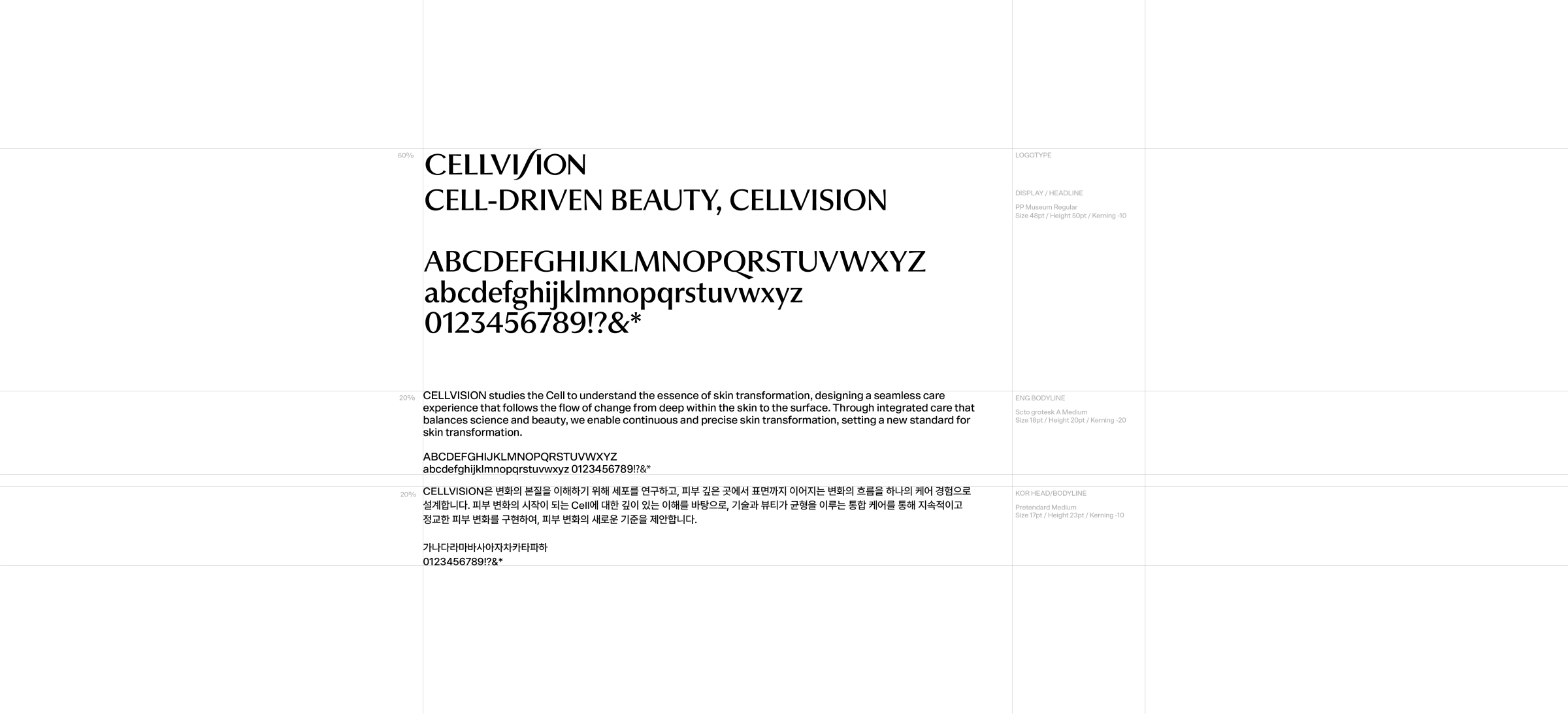
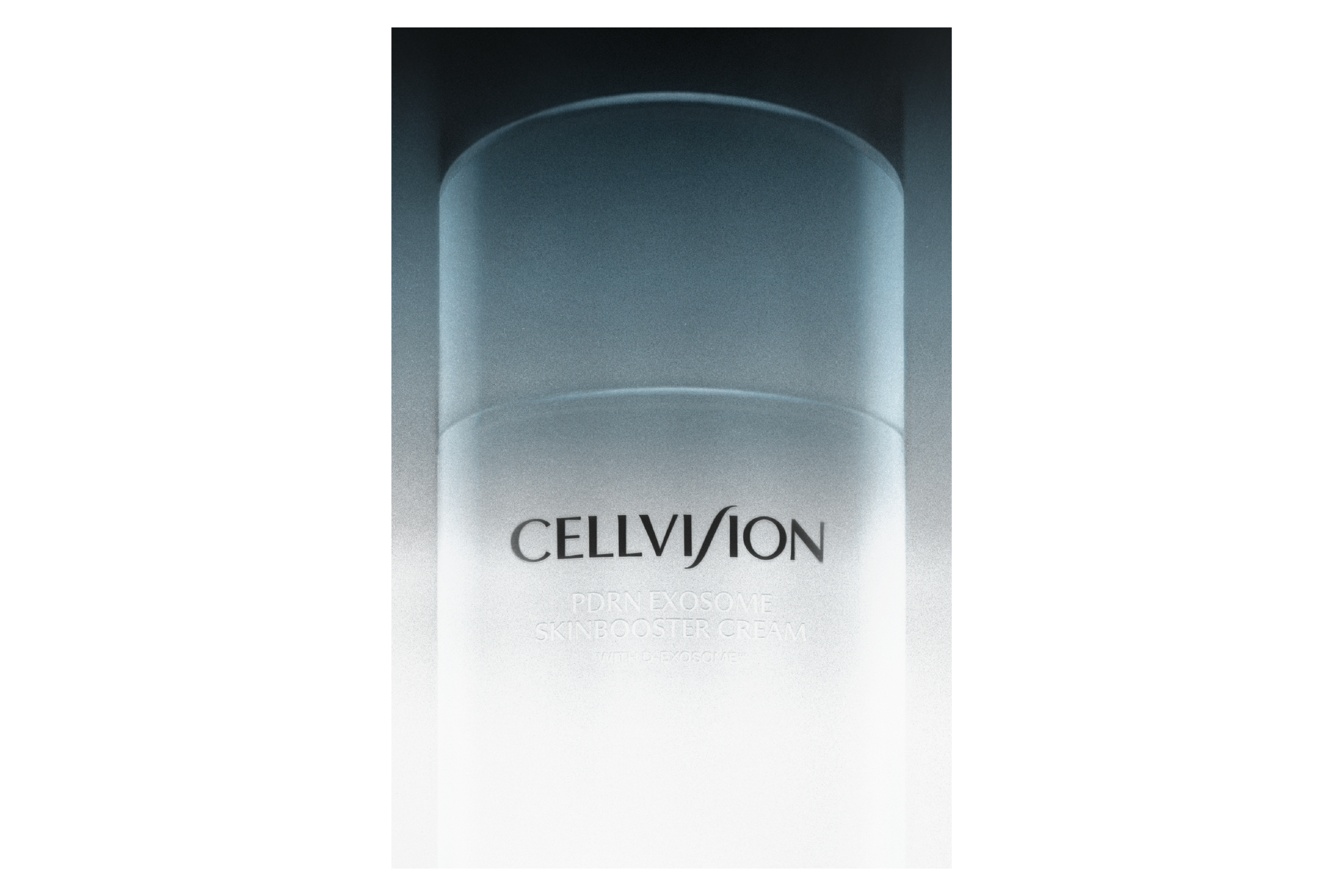
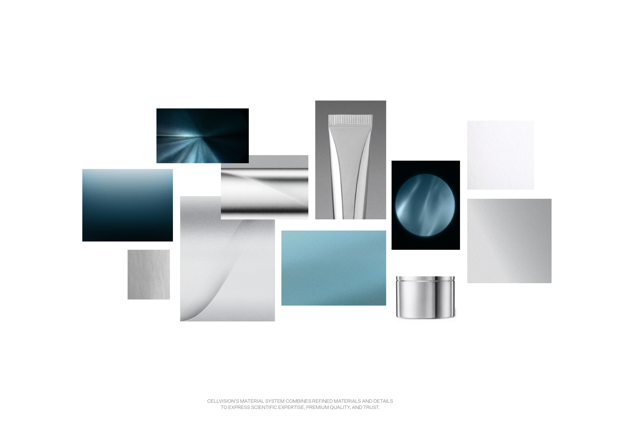
Built upon stable proportions and a balanced structure, the visual system was designed for consistent application across the logotype, graphics, and packaging, establishing a distinctive CELLVISION identity that balances scientific precision with delicate care.


Partakers : Haam Younghoon (Creative director), Kang Subin(Project Manager), Yun Seoyoung [Designer]

CELLVISION is a total beauty care brand that focuses on the cells where skin transformation begins, offering integrated skincare solutions that connect beauty devices with skincare products.

This project aimed to translate the brand’s combination of scientific technology and delicate skincare into a cohesive visual language, using cells deep within the skin—the starting point of transformation—and the flow of care extending to the skin’s surface as key motifs. The circular characteristics of cells are reflected in the C and O of the logotype, expressing a scientific perspective focused on the essence of skin transformation, while the S motif represents the flow of care from deep within the skin to its surface.

Built upon stable proportions and a balanced structure, the visual system was designed for consistent application across the logotype, graphics, and packaging, establishing a distinctive CELLVISION identity that balances scientific precision with delicate care.


Partakers : Haam Younghoon (Creative director), Kang Subin(Project Manager), Yun Seoyoung [Designer]
Previous Project
Next Project
Back to list

CELLVISION is a total beauty care brand that focuses on the cells where skin transformation begins, offering integrated skincare solutions that connect beauty devices with skincare products.

This project aimed to translate the brand’s combination of scientific technology and delicate skincare into a cohesive visual language, using cells deep within the skin—the starting point of transformation—and the flow of care extending to the skin’s surface as key motifs. The circular characteristics of cells are reflected in the C and O of the logotype, expressing a scientific perspective focused on the essence of skin transformation, while the S motif represents the flow of care from deep within the skin to its surface.

Built upon stable proportions and a balanced structure, the visual system was designed for consistent application across the logotype, graphics, and packaging, establishing a distinctive CELLVISION identity that balances scientific precision with delicate care.


Partakers : Haam Younghoon (Creative director), Kang Subin(Project Manager), Yun Seoyoung [Designer]
Founded in 2020, orkr is a brand design consultancy based in south korea
(C) ORKR
SNS